Why Script Tattoos Are Harder Than They Look
Pick up any book and look at the letter 'g'. The bowl, the ear, the descender loop. Each curve has a specific relationship to the others. Move one curve 2mm and the letter reads wrong. Permanently. That's the reality of script tattooing, and it's why finding the best script tattoo artist you can is worth the research.
Text is the one tattoo subject every person walking past can read and judge in under a second. A portrait can absorb a slightly soft edge. A floral piece can carry a petal that's a touch too wide. Script has nowhere to hide.
The margin for error in letterforms
Every letterform in a word connects to the next. A single misplaced curve in one character throws off the rhythm of the whole line. Readers notice it the way a musician notices an off note. Instantly, even if they can't name what's wrong.
No heavy shading or tonal complexity masks poor line control in script. The work is exposed. That's what makes it demanding, and what makes a well-executed piece so satisfying to wear.
Why script attracts both the best and worst tattooing
On the surface, script looks simple. No complex rendering, no colour mixing, no layered shading. So studios with weaker technical foundations take it on, and the results show up in healed photos years later: blurred strokes, blown-out serifs, letters that have merged into one another.
The best lettering artists know that simplicity is a trap. Less visual information means every imperfection has more space to be seen. The craft goes deeper, not shallower.
What Separates a Good Script Artist from a Great One
Skill in script tattooing isn't one thing. It's a combination of machine control, typographic knowledge, and spatial thinking. Miss any of those and the piece suffers.
Line weight consistency and needle control
Consistent line weight. Keeping every stroke the same thickness across a word. Requires the artist to move at exactly the right speed throughout. Move too slowly and the needle lingers, burning the surrounding skin and producing a thick, feathered edge. Move too fast and the ink thins out, leaving a stroke that looks like it ran out of ink halfway through.
This is pure hand skill. It develops over thousands of hours. You can see it immediately in the portfolio: look at the uprights of letters like 'l' or 'i' across a word. If they match, the artist has control. If they vary, they don't.
For fineline tattooing in particular, needle gauges go finer and the margin for error shrinks further. A single-needle script piece demands even steadier pressure and pace than standard script work.
Font selection and custom lettering design
A great script tattoo artist doesn't print a font onto skin unchanged. Fonts are designed for flat screens and paper. Skin curves, stretches, and changes over decades. A skilled artist takes a typeface as a starting point, then redraws the letterforms by hand. Tightening the ink traps (the small negative spaces where strokes meet), adjusting hairline weights, and modifying ascenders and descenders so they read correctly on a three-dimensional surface.
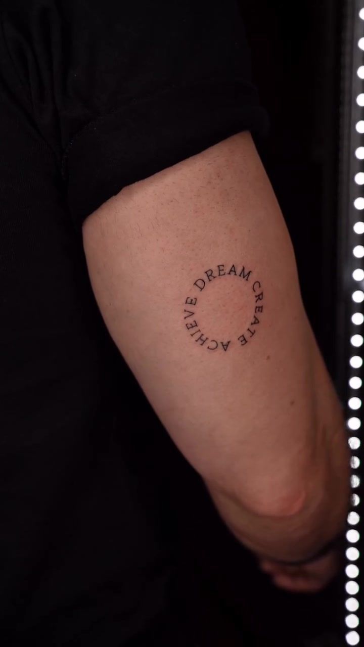
This is the difference between custom lettering and a copy-paste job. Look at our Dream Create Achieve circular lettering piece to see how letterforms adapt to a curved, radial arrangement. The spacing and geometry are hand-adjusted, not software-generated.
Placement and how text wraps the body
A phrase on the inner forearm reads differently to the same phrase wrapping the ribs. The forearm is relatively flat. The rib cage is a cylinder. Letters that sit evenly on a flat surface start to compress or stretch when they follow a curve.
Great script tattoo artists think about this before they put stencil to skin. They adjust letter spacing. Called kerning in typography. For each specific placement. A sternum piece needs different spacing to a forearm script of the same phrase. That manual adjustment is what makes text feel like it belongs on the body rather than sitting on top of it.
Portfolio Red Flags and Green Flags
A portfolio tells you everything, if you know what to look for. Most people look at whether they like the style. That's step one. Step two is reading the technical quality.
What healed script looks like versus fresh
Fresh-ink photos are nearly useless as quality indicators. Ink sits raised on the surface immediately after a session, and everything looks sharp in that state. What you need to see is how the work heals.
Ask directly for healed photos. A confident artist has them. Healed fineline script should still read clearly at 6 to 12 weeks post-session. If the strokes have blurred into one another or the thin hairlines have disappeared, the sizing was too small or the needle technique wasn't clean enough.
For more on evaluating portfolio quality in fineline work, see our guide on what fineline work actually demands.
Questions to ask before you book
- Can I see healed photos of script work, specifically on the placement I'm considering?
- Will you custom-draw the lettering or apply a pre-made font stencil unchanged?
- How do you adjust kerning for the placement I've chosen?
- Do you have examples across different script styles. Cursive, serif, single-line minimalist?
- What aftercare do you recommend for this time of year and this placement?
Red flag: an artist who shows only macro close-ups without placement context. Beautiful at 5cm distance doesn't tell you how the piece reads from a normal viewing distance.
Green flag: a portfolio showing variety across script styles, placements, and skin tones. That breadth means the artist adapts to each client rather than repeating one formula.
How the Studio Approaches Lettering in Lisbon
Finding the right script tattoo artist in Lisbon takes more than browsing Instagram. The city has genuine tattooing talent, but lettering specifically requires a portfolio that demonstrates typographic understanding alongside technical execution.
From brief to stencil: the consultation process
Every lettering piece at this studio begins with a conversation about meaning, not just aesthetics. What does this phrase mean to you? Where does it come from? Do you want it to feel timeless, contemporary, or somewhere between? Those answers shape every decision that follows.
After the brief, the artist manually adjusts letter spacing for the chosen placement. A forearm wrap carries letters differently to a sternum piece. Both need different kerning decisions. That hand-adjustment happens before a stencil is ever produced.
Lisbon's humid summers add a real variable to post-session care. Warm, humid conditions slow down the surface drying of a fresh tattoo. The studio gives specific aftercare guidance based on when you're sitting. A July session in the heat gets different advice to a December appointment in Lisbon's mild winter. Keeping fresh lettering out of direct sun is especially important, since UV exposure during early healing can cause thin ink lines to fade before they've fully settled into the dermis.
For a broader look at what great lettering actually takes in Lisbon, the studio's approach covers the full process from consultation through to healed results.
Style options: script, serif, minimalist text
The studio's custom lettering service covers the full range: flowing cursive script, clean serif text, minimalist single-line letterforms, and curved or circular arrangements. Each demands a different approach to sizing, spacing, and needle weight.
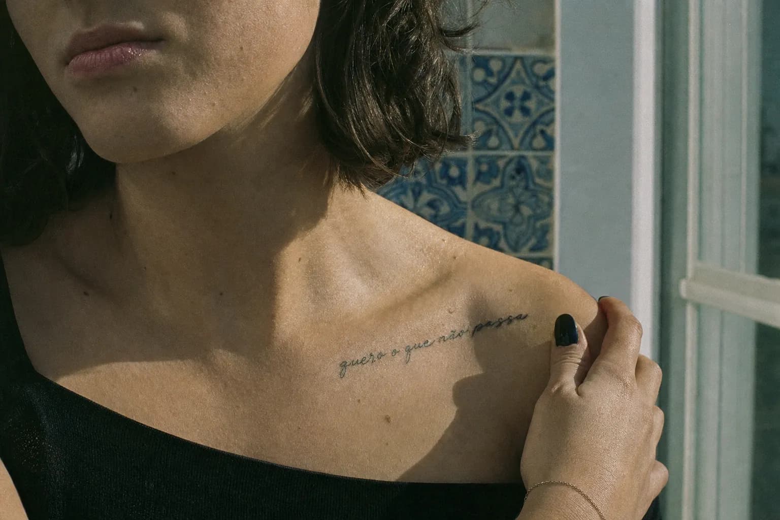
The fine script forearm tattoo in the portfolio shows what a single-needle fineline approach produces at a practical scale. The strokes stay consistent across the full width of a forearm, and the letterforms read clearly without thickening into blobs.
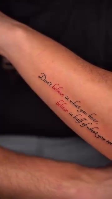
Fine script tattoo work in Portugal has grown significantly in demand over recent years. Clients arriving from across Europe specifically seek out studios that combine typographic understanding with technical fineline execution. The azulejo tile tradition. Geometric, precise, built on repetition and symmetry. Speaks to the same eye for structured detail that good lettering demands.
"The letters have to feel like they were always there. If the placement is right and the kerning is honest, the text stops being a tattoo and starts being part of the person."
Practical Guidance: Sizing, Placement, and What to Expect
Minimum sizing for legible script
The lower boundary for fineline script is roughly 5 to 6mm letter height. Below that, the thin strokes in cursive or hairline serif letterforms don't have enough ink mass to survive healing without blurring into the surrounding skin.
Bold serifs hold up slightly smaller than delicate cursive. But any lettering tattoo in Lisbon. Or anywhere. That goes below 4mm in a fine style is likely to lose legibility within two years. Size is not just an aesthetic choice. It's a longevity decision.
Our guide on tiny tattoos in Lisbon covers this in more detail, including why small work demands the highest technical precision of any style.
Best placements for longevity
Inner forearm, upper back, sternum, and outer bicep are the most stable placements for script. These areas have relatively low day-to-day friction, don't stretch dramatically with movement, and stay protected under clothing most of the year.
Fingers, wrists, and feet age script fastest. Fingers flex constantly and rub against everything. Feet experience friction from footwear all day. Both locations almost always need a touch-up session within the first year, sometimes sooner.
Session length by piece size
A short phrase on the forearm. Five to eight words in a single line. Runs 1 to 1.5 hours including stencil placement and any final adjustments. A longer quote wrapping the ribs, or a multi-line arrangement on the upper back, typically takes 2.5 to 3.5 hours.
| Placement | Longevity | Sun Exposure Risk | Typical Session Length |
|---|---|---|---|
| Inner forearm | Very good | Moderate (sleeves help) | 1. 1.5 hours |
| Sternum / chest panel | Excellent | Low (usually covered) | 1.5. 2.5 hours |
| Upper back | Excellent | Low (usually covered) | 2. 3 hours |
| Rib wrap | Good | Low | 2.5. 3.5 hours |
| Outer bicep | Good | Moderate | 1. 2 hours |
| Wrist | Moderate (fades) | High | 45 min. 1 hour |
| Fingers | Poor (touch-ups likely) | High | 30. 45 min |
| Foot / ankle | Poor (touch-ups likely) | Moderate | 45 min. 1.5 hours |
What to bring to your appointment
- Any font references you like. Screenshots, printed samples, or handwriting you want replicated.
- The exact quote or phrase, written out and double-checked for spelling. The studio checks too, but two pairs of eyes catch more than one.
- Examples of placements you've seen that felt right. Not to copy, but to indicate the scale and weight you're drawn to.
- Loose, comfortable clothing that gives easy access to the placement area.
- A meal beforehand. Sessions over an hour go better when your blood sugar is stable.
Frequently Asked Questions
Does script tattooing hurt more than other styles?
Pain varies more by placement than by style. Script on the inner forearm or upper back sits in the moderate range for most people. Script on the ribs, sternum, or along the spine tends to feel more intense. The actual tattooing motion in script work. Long, smooth strokes rather than repeated short passes. Is often described as more tolerable than heavy shading on the same spot.
How small can lettering go and still look good after healing?
For fineline script, letter height should be at least 5 to 6mm to stay legible once healed. Smaller than that, the fine strokes tend to blur into the skin over time. The exact minimum depends on the style. A bold serif holds up smaller than a delicate cursive with thin hairline strokes.
How long does a script tattoo take to fully heal?
Surface healing takes two to three weeks. The deeper dermis layer, where the ink actually sits, finishes settling at around six to eight weeks. Fineline script can look slightly faded or cloudy during weeks two through four. That's normal. Judge the final result only after the eight-week mark.
Can I bring my own font or quote to the consultation?
Yes, and it helps. Bringing reference. A font you love, handwriting you want replicated, or examples of pieces you've seen. Gives the artist a strong starting point. The lettering will still be adapted by hand to suit your specific placement and skin, but a clear reference shortens the design process considerably.
What's the difference between script and lettering tattoos?
Script refers specifically to cursive or handwriting-style letterforms. Lettering is the broader category. It includes script, serif, sans-serif, block capitals, and custom typography. A good lettering artist works across all these styles and adapts the form to fit the placement, the meaning, and the person wearing it.
Do fineline script tattoos need touch-ups?
Some do, some don't. It depends on placement, skin type, and aftercare quality. A fineline forearm script on someone who follows aftercare carefully and keeps the area out of direct sun usually heals solidly. High-movement or high-friction placements are far more likely to need a touch-up session three to six months later.