Why Script Tattoos Are Harder to Get Right Than They Look
The difference between a word that reads and a word that lasts
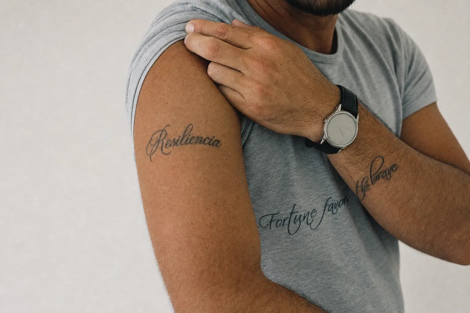
Pick up a pen and write a sentence. Now imagine that sentence carved permanently into skin, viewed daily, and judged letter by letter for the rest of your life. That's the pressure a script tattoo carries. Unlike an illustrative piece where a slightly uneven shadow gets absorbed into surrounding detail, lettering has nowhere to hide.
Every letterform is exposed. Spacing, baseline consistency, stroke weight, the way two letters sit beside each other. All of it is legible to anyone who looks. A misaligned crossbar on a lowercase 't' or an inconsistent gap between two words reads immediately, even to people who couldn't name what's wrong.
What makes script hold up over years is a combination of things: the right letter height for the placement, ink deposited at the correct depth, and a stencil that was positioned with real care. Good script tattoos look almost effortless. That's usually the result of a lot of work before the needle ever touches skin.
Why most regrettable script tattoos fail at the same two points
The first failure point is stencil placement. If a stencil sits even 2mm off-centre on a piece that's meant to follow the forearm's natural axis, you'll see it every time you look down. Circular lettering that isn't centred properly is impossible to unsee. This isn't something you can correct once the work is done.
The second failure point is font choice. Many artists simply scale a computer font and apply it unchanged. But digital fonts are designed for screens and paper, not for skin that moves, curves, and breathes. Thin serifs that look refined at 12pt can close up entirely as ink settles into the dermis over six to eight weeks. A font chosen for how it looks on a phone screen often bears very little resemblance to how it reads healed on a wrist.
Needle size compounds both problems. Fine script requires a single needle or tight liner to preserve stroke definition. Use a needle that's too heavy for the chosen weight, and what looked delicate in the stencil comes out bolder than intended, losing the precise spacing the design depends on.
What 'Custom Lettering' Actually Means in a Tattoo Context
Font selection versus hand-drawn type
There's a meaningful difference between an artist who prints a font and transfers it to skin, and one who hand-adapts letterforms to suit the body part, the scale, and the person wearing it. Custom lettering tattoo work starts with a reference. A style, a feeling, a piece of typography you've responded to. And then rebuilds those letterforms from scratch with skin in mind.
Skin has texture, curvature, and movement. A letter drawn for skin needs slightly different proportions than the same letter drawn for a printed page. The studio's approach to its custom lettering service involves adapting or hand-drawing each piece rather than placing a font file unedited. That extra step is often what separates a tattoo that feels considered from one that feels generic.
How sizing and skin placement change everything
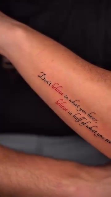
Where you put script on the body changes how it ages. The forearm is one of the most forgiving placements for lettering: the skin is relatively flat, tension is consistent, and the area heals predictably. The collarbone and upper back offer similar stability. Ribs, fingers, and the inside of the wrist are more complicated. Skin there is softer or subject to more friction, and fine lines can migrate slightly as they settle.
Size matters in a very practical way. As a working rule, individual letterforms should be at least 5 to 6mm tall for fine script to remain legible after healing. Below that threshold, ink spread during healing can close up counters (the enclosed spaces inside letters like 'o', 'e', and 'a'), turning crisp text into something blurry and hard to read.
The Studio's Approach to Script and Lettering Work in Lisbon
From consultation to stencil: the design phase
Before anything is drawn, the studio spends real time in consultation. That means gathering reference images, confirming the exact text (spelling included. This sounds obvious, but it matters enormously), discussing scale, and walking through placement options on the actual body. The client sees and approves the stencil before the session begins. This isn't a premium add-on; it's standard practice.
Once the stencil is finalised, placement is checked for alignment, not just eyeballed. For anything with a horizontal baseline or a radial structure, the artist uses body landmarks. The crease of the elbow, the line of the collarbone, the natural axis of the forearm. To anchor the stencil before pressing it to skin. A stencil that's sat precisely on those landmarks gives the finished piece its sense of intentionality.
"Script should feel like it belongs on the body, not like it was dropped onto it. The difference is almost always in the preparation, not the tattooing itself."
Needle choice and ink weight for fine script
For delicate lettering. Think fine script on the forearm, a short phrase on the collarbone. The studio works with a single needle or a tight 3RL liner (three needles in a round configuration, clustered tightly). These deliver ink in a very narrow channel, preserving the hairline strokes that make fine script feel elegant rather than heavy.
For bolder statement pieces, a slightly wider liner gives more ink coverage per pass, building up solid stroke weight without the need for repeated passes that can push ink unevenly. The right needle for the job isn't a stylistic preference. It's a technical decision based on the letter height, the chosen weight, and the placement's skin type.
Script Tattoo Styles the Studio Works With
Fine script and minimalist lettering
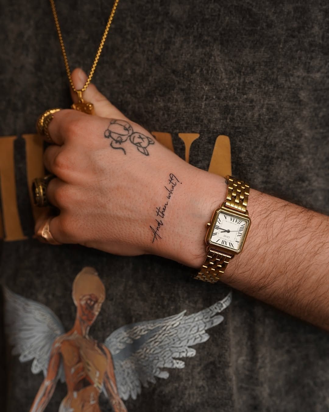
Fine script is technically the most demanding of all lettering styles. The margin for error is narrowest, the strokes are thinnest, and the healed result is the clearest test of an artist's line control. Single-needle script on the forearm, a minimalist phrase on the inner arm, or a short word on the ribcage all fall into this category. For anyone searching for the best script tattoo artist near me, healed examples of fine script are the most telling thing to look for in a portfolio.
Circular and geometric lettering layouts
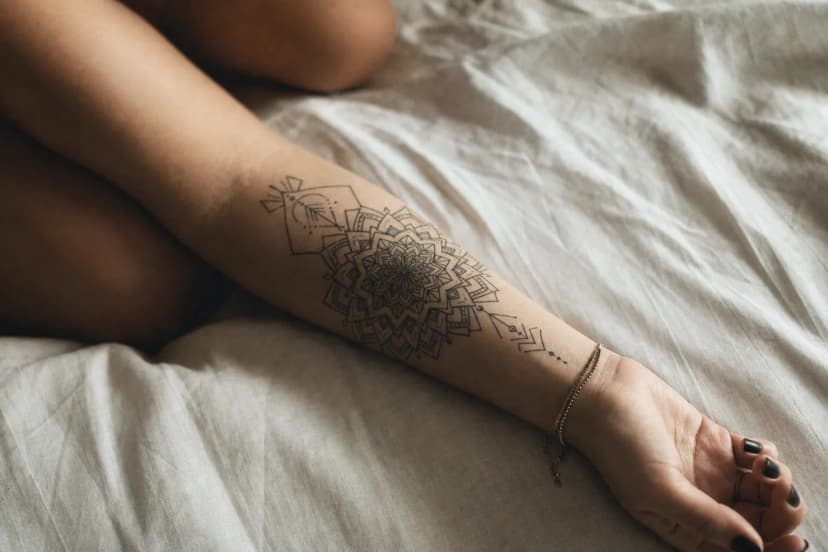
Circular lettering. Text arranged along a curved or fully closed path. Is one of the more structurally interesting formats in tattooing. Lisbon has its own visual language for this kind of geometry. The azulejo tiles that cover walls across Alfama and Príncipe Real are built on radial and grid-based patterns; circular lettering fits naturally into that same sense of measured order. The circular lettering piece in the studio's portfolio shows how text arranged on a precise radius can feel balanced and architectural rather than simply decorative.
Script combined with floral or illustrative elements
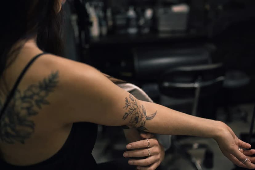
Combining script with florals or geometric frames is one of the most common requests the studio receives. The compositional challenge is giving both elements enough space. Lettering needs visual breathing room to remain legible. If botanical detail crowds the letters too closely, the text suffers. During the planning stage, the artist maps how text and illustration will interact spatially, adjusting the composition before committing to a stencil.
| Script Style | Typical Size | Session Length | Best Placements | Healing Complexity |
|---|---|---|---|---|
| Fine / Single-Needle Script | 5-15cm phrase | 1-2 hours | Forearm, collarbone, upper back | Low to moderate. Keep moisturised, avoid sun |
| Bold Statement Lettering | 8-25cm | 2-3 hours | Upper arm, chest, back | Moderate. Heavier ink deposit needs time to settle |
| Circular / Geometric Layout | 6-20cm diameter | 2-4 hours | Forearm, shoulder, back | Moderate. Radial stencil precision is critical |
| Script + Floral or Illustrative | 10-30cm | 2-4 hours | Forearm, thigh, ribcage | Moderate to high. Multiple element types healing together |
| Minimalist Word / Single Word | 3-8cm | 45 min-1.5 hours | Wrist, ankle, inner arm | Low. But small letterforms need careful aftercare |
Practical Guide: Preparing for Your Script Tattoo Appointment
What to bring and confirm before you arrive
Write out your chosen text clearly before your appointment and double-check every word. Bring that confirmation in writing. A note on your phone is fine. Also bring any reference images that reflect the style or feeling you're going for. The studio uses these during the design review, not to copy directly, but to understand what draws you to a particular letterform or layout.
- Confirmed, spell-checked text in writing. Never rely on memory alone
- Reference images showing styles, weights, or compositions you like
- Clothing that gives clear access to the placement area without needing to remove it entirely
- A meal beforehand. Your blood sugar will thank you during a two-hour session
- Any existing tattoos nearby, so the artist can plan for how the new piece sits in relation to them
Healing realities for lettering tattoos in Lisbon's climate
Lisbon's summers are warm, humid, and bright. That combination affects healed ink on visible placements. Particularly the forearm and hand, which get constant UV exposure. Sun damages healed tattoo ink over time, fading fine lines faster than broader, darker work. On a fine script forearm tattoo, even a few summers of unprotected sun can noticeably soften the contrast between the ink and the surrounding skin.
Apply SPF 30 or higher over any healed lettering when you're outside. This is especially relevant in Lisbon from May through September, when UV index regularly climbs into the high range. During the first four weeks of healing, sun isn't the only concern: salt water at Cascais or Comporta, chlorinated pools, and prolonged humidity from the sea air can all interfere with the healing process. Keep the tattoo out of the water until it's fully closed.
- For the first two weeks: wash gently twice daily with fragrance-free soap, pat dry, apply a thin layer of unscented moisturiser
- Avoid soaking. Showers are fine, but no swimming for at least four weeks
- Keep the piece out of direct sunlight while healing; wear loose clothing over it if you're outdoors
- Once fully healed, apply SPF before any extended time in the Lisbon sun
- Fine script may look slightly milky during weeks two and three. This is the outer skin layer regenerating, not a sign of fading
For a deeper look at technique and aftercare specific to script work, the studio's guide on what great lettering actually takes covers these questions in more detail. And if you're still exploring styles beyond lettering alone, the studio's work in fineline and minimalism often intersects with script in interesting ways.
Frequently Asked Questions
How do I know if a script tattoo artist is actually good at lettering?
Ask to see healed portfolio photos, not just fresh work. Fresh ink looks sharp on almost everyone; healed tattoos show the truth. Look for even spacing, a consistent baseline, and letterforms that are fully closed and defined. A skilled lettering tattoo artist in Lisbon will show multiple styles and talk through font choices during consultation rather than presenting a single default option.
How small can script go before it becomes illegible after healing?
Individual letters generally need to be at least 5 to 6mm tall for fine script to survive healing legibly. Below that, ink spread as it settles into the dermis can close up the interior spaces of letters like 'o', 'e', and 'a', turning crisp text into a blurred line. Placement matters too: fingers and wrists move more, so letterforms there need slightly more height to age well.
How long does a script tattoo session in Lisbon typically take?
A short phrase on the forearm usually runs one to two hours, including stencil placement and any last-minute adjustments. Longer pieces, circular layouts, or script combined with illustrative elements take two to four hours. Most design decisions are resolved before your session begins, so the time in the chair stays focused on execution rather than revision.
Where on the body do script tattoos age best?
The upper arm, forearm, collarbone, and upper back all offer relatively stable skin that holds fine lines well over years. Fingers, hands, and feet experience more friction and direct sun, so script there tends to require touch-ups sooner. Ribs and the inner bicep are popular placements, but the skin is softer, which means ink settles slightly differently than on flatter areas.
Can I combine script with a floral or geometric design?
Yes. It's one of the most requested combinations at the studio. The key is compositional balance. Lettering needs its own visual space so the two elements don't compete. Before any stencil is cut, the artist works out how text and illustration interact spatially, ensuring the script stays legible once the surrounding detail is in place. See how this works in practice with this script and floral hand tattoo from the portfolio.