Why Lettering Tattoos Are Harder Than They Look
Pick up any book on typography and you'll find centuries of rules about spacing, weight, and rhythm. Now try applying those rules to a curved forearm while the surface breathes and stretches beneath your needle. That's the problem every lettering tattoo artist faces on every single piece.
People underestimate lettering because the subject matter looks simple. Words. Letters. How hard can it be? But the truthful answer is: considerably harder than most other tattoo styles. There's nowhere to hide when something's off.
The margin for error is near zero
If a shading tone in a realism portrait is slightly uneven, the eye often absorbs it as texture. If one letter in a script piece sits 1mm too low, you'll notice it every time you glance at your arm. That gap doesn't close over time. It stays.
Lettering demands absolute consistency across stroke weight (how thick or thin each line is), spacing between characters, and baseline alignment (the invisible horizontal line all letters sit on). Get any one of those wrong and the whole piece reads as amateurish, regardless of how beautiful the intention was.
Typography on skin behaves differently than on paper
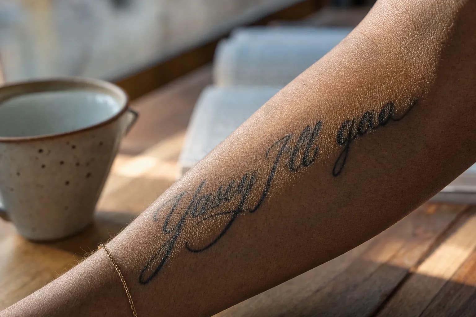
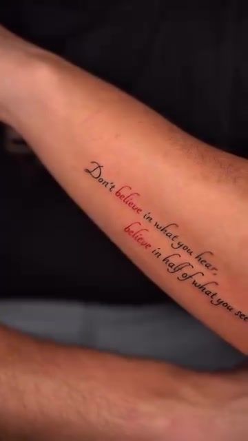
Flat design rules don't transfer directly onto a body. A collarbone curves. A ribcage expands with every breath. An inner arm tapers from elbow to wrist. Text that looks perfectly spaced on a stencil can appear compressed or distorted once wrapped around a limb.
Skilled artists account for this during the design phase, adjusting letter spacing and baseline curvature before the stencil ever touches skin. It's a pre-emptive correction most clients never see. But they'd absolutely notice if it weren't done.
What Actually Makes a Lettering Artist Skilled
Technical fluency in lettering goes well beyond having steady hands. It involves understanding how type is constructed, how ink behaves at fine scales, and how to transfer a flat design onto a three-dimensional, moving surface without losing its integrity.
Stencil accuracy and baseline control
The stencil is the blueprint. If it's placed even slightly off-axis on a curved placement like the collarbone or forearm, the finished tattoo will read as crooked. A good artist takes time positioning the stencil, checks it from multiple angles, and adjusts before committing.
Baseline control extends through the entire session. As the artist works across a longer phrase, maintaining that consistent horizontal reference requires discipline. Rushing this step is where many lettering pieces go wrong.
Needle gauge and line consistency
A single needle (also called a 1RL. Round liner, one needle) produces the finest, most delicate strokes. It's the tool of choice for hairline scripts and fine line lettering tattoos where every thread of ink needs to stay precise. Shader needles, which group multiple needles together, suit bolder, block-style lettering where you're packing ink into thicker strokes.
Using the wrong tool for the style produces immediately visible results. Hairline script attempted with a shader needle bleeds. Bold block lettering attempted with a single needle requires excessive passes and risks overworking the skin.
Understanding typeface structure
An artist who genuinely understands type anatomy produces work on a different level. Knowing what ascenders (the upward strokes on letters like 'b', 'd', 'h') and descenders (the downward strokes on 'g', 'p', 'y') are supposed to do. And how counters (the enclosed spaces inside letters like 'o', 'e', 'p') need to stay open to remain legible. Is what separates copying a font from actually hand-lettering a piece.
There's a meaningful difference between dropping a downloaded font onto a stencil and drawing letterforms from understanding. The latter adapts to the scale, placement, and curvature of the specific body it's going on. The former often doesn't.
"Every piece of lettering on skin is a custom typography problem. The body is the canvas, and it doesn't behave like a flat page. The design has to be built for where it's going to live."
How to Evaluate a Lettering Portfolio Before You Book
A portfolio tells you almost everything you need to know about a lettering artist. If you know what to look at. Most people look at the wrong things.
What healed work tells you
Fresh tattoo photos are shot under ideal lighting, often immediately after the session when the ink sits at its sharpest. Healed work is the honest version. Ask any artist you're considering to show you healed examples. If they can't or won't, that's a significant concern.
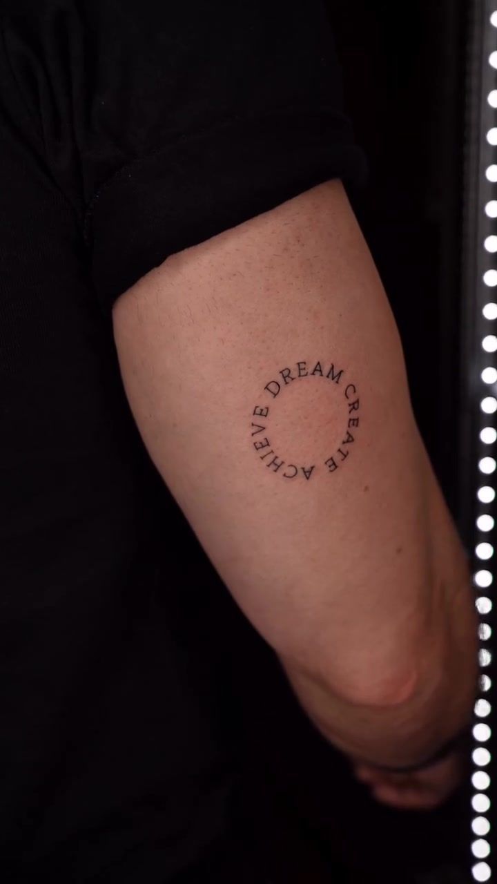
In healed lettering, look for three things: consistent stroke weight across all letters, open counters (that enclosed space in letters like 'o' and 'p' should still be clearly defined), and a baseline that reads as level. These qualities survive healing in a well-executed piece. They don't in a rushed one.
Red flags to watch for
- Blowouts. Ink that has spread beyond the line, creating a blurred or shadowy edge. Common in areas with thinner skin and a sign of needle depth issues.
- Wavy baselines. Text that drifts upward or downward mid-phrase rather than holding a consistent horizontal line.
- Inconsistent spacing. Some letter pairs cramped, others too wide. This is a stencil and layout problem, not a skill-ceiling issue that improves with time.
- Closed counters. Letters like 'e', 'o', 'a' where the enclosed space has filled in during healing, making words hard to read.
- Lack of variety. A portfolio showing only one style of script (say, only thin italics) suggests limited typographic range. You want to see serif work, block lettering, mixed layouts.
Portfolio breadth matters. An artist who can do delicate scripts, bold block lettering, and mixed typographic layouts has built genuine knowledge of typeface structure. One who works in a single style hasn't been tested across the full range of what custom lettering tattoos actually demand.
How the Studio Approaches Lettering in Lisbon
When someone comes to the studio looking for a lettering tattoo in Lisbon, the first conversation isn't about fonts. It's about the text itself. What does it mean? How does that meaning shape the visual weight it should carry? A memorial phrase reads differently from a personal mantra, and the letterforms should reflect that.
Consultation and custom design
No piece starts from a dropped-in font. Every layout is drawn or adapted specifically for the person, the text, and the placement. Bringing a font reference to the consultation is genuinely useful. It communicates the mood and style you're drawn to. But think of it as a conversation starter, not a final brief.
The artist considers the personality of the typeface alongside the meaning of the words. A thin, elegant italic carries a different emotional register than a bold serif with thick vertical strokes. Getting that match right is part of what makes a piece feel coherent rather than arbitrary. For more on this process, our guide on what to look for in a Lisbon lettering artist goes into the detail of how studio consultations actually work.
You can also review what great script work actually requires for a broader breakdown of the technical standards involved before you begin comparing studios.
Placement advice for longevity
Placement isn't purely aesthetic. Certain locations fade faster, distort more, or make sizing genuinely difficult. Fingers and hands are high-friction zones. The skin constantly rubs against surfaces, accelerating pigment loss. The studio is direct about this during consultation. Lisbon's climate adds a layer to that conversation: summer humidity affects fresh healing, and the city's sun exposure makes aftercare more demanding than in northern climates.
For placements like the collarbone, the artist maps the baseline curvature before finalising the stencil, accounting for the natural arc of the bone. Ribcage lettering requires additional baseline adjustment because the skin there moves significantly during breathing. These aren't small considerations. They're what separates a hand lettered tattoo near me that still looks sharp in five years from one that doesn't.
Sizing, Placement, and What to Expect in the Chair
Lettering tattoos have hard minimum size requirements that most people aren't told about upfront. For most script styles, individual letters should be at least 5-6mm tall. Below that, the fine strokes that define letterforms close in on themselves during healing. What was crisp becomes blurred. Bold block lettering tolerates smaller scales better than hairline scripts. But every style has a floor, and your artist should tell you clearly where that floor is for your chosen text.
Bring the following to your consultation:
- The exact text you want, confirmed and spelled correctly (the artist cannot be responsible for errors in text you provide).
- Font references or style images. Even rough ideas about whether you want something delicate or bold.
- Photos of placement areas on your own body, not just generic reference images.
- Examples of scripts you've seen that you like, including healed photos if you can find them.
Session length varies considerably depending on what you're having done. A short phrase in clean script on a flat area of skin can be completed in 45 minutes. A longer quote with ornamental framing, or a piece that incorporates floral detail alongside the text, typically runs two to three hours. The studio will give you a realistic time estimate after seeing the final layout. Not before. Estimates made before the design is settled are always guesses.
For context on how sizing and placement interact across different small-format styles, our article on tattoo placement ideas for small tattoos covers the geometry of fit in practical terms.
| Placement | Longevity | Typical Session Length | Key Consideration |
|---|---|---|---|
| Forearm (outer or inner) | High | 45 min. 2 hrs | Flattest canvas; easiest baseline control |
| Upper arm (outer) | High | 45 min. 2 hrs | Good surface; works well for longer phrases |
| Collarbone | Medium-High | 1. 2 hrs | Curved baseline mapping required; striking placement |
| Ribcage | Medium-High | 1.5. 3 hrs | Skin movement during breathing; stacked layouts suit this area |
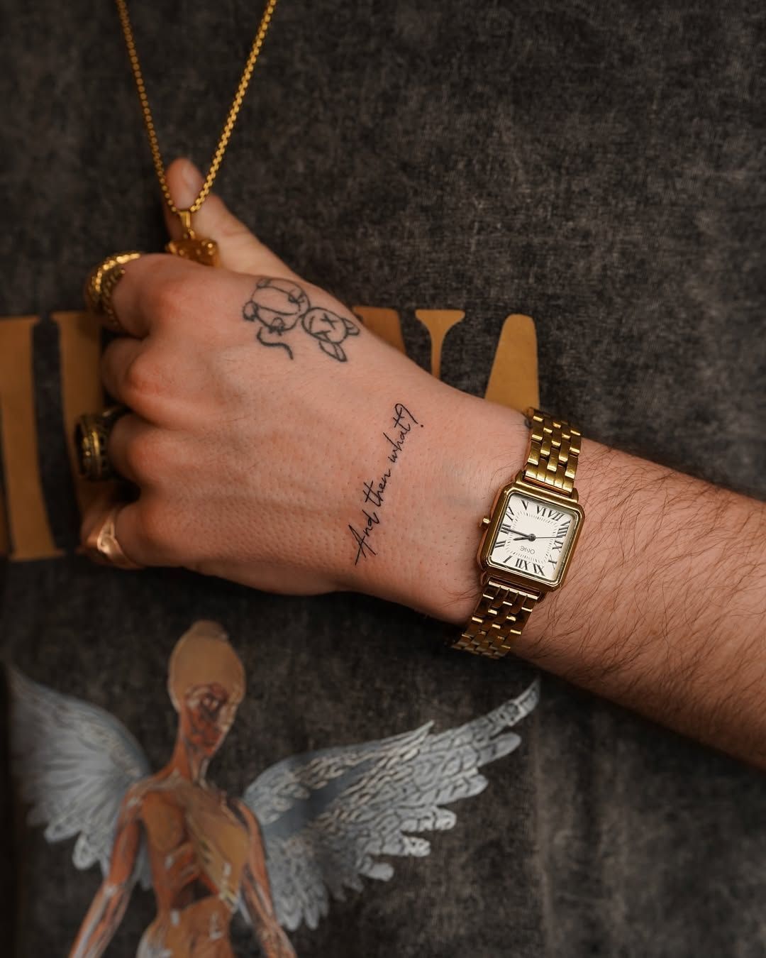
| Fingers / Hands | Low | 30. 60 min | High friction; fades faster; touch-ups likely needed |
| Wrist / Inner wrist | Medium | 30. 75 min | Skin is thin; sizing minimums especially important here |
Frequently Asked Questions
How small can a lettering tattoo be and still heal well?
For most script styles, individual letters should be at least 5-6mm tall to survive healing intact. Below that threshold, fine strokes close in on themselves as the skin heals, turning crisp letterforms into blurred marks. The minimum size depends on the typeface. Hairline scripts need more height than bold block letters. Your artist will advise on this during the design stage.
How long does a lettering tattoo session take?
A short phrase on a flat area of skin typically takes 45 to 90 minutes. A longer quote with ornamental framing or floral detail can run two to three hours. Session length depends on letter count, style complexity, and placement. The studio gives a realistic time estimate after seeing the final layout, not before. Pre-design estimates are rarely accurate.
Does lettering fade faster than other tattoo styles?
Fine script can fade faster than bold blackwork, mainly because the line weight is thinner and holds less pigment in the dermis. Placement matters considerably: fingers and hands fade quickly due to constant friction, while the forearm or upper arm holds lettering much longer. Proper aftercare and consistent sun protection slow fading significantly, particularly in Lisbon's sunny climate.
Can I bring a specific font to my lettering tattoo consultation?
Yes, and it helps. A font reference communicates the mood and style you want and gives the artist a clear starting point. But a skilled lettering artist won't simply trace a digital font onto your skin. They'll adapt it for the placement, scale, and curvature of your body. Think of your font reference as inspiration, not a final blueprint. The custom typography tattoo process requires that adaptation.
What's the best placement for a long quote tattoo in Lisbon?
The outer forearm and outer upper arm offer the flattest, most stable canvas for longer text, making baseline control easier. The ribcage works well for a stacked, vertical layout but involves more movement during the session. Collarbone placements look striking but require careful baseline mapping to account for the curve. Your artist should walk you through each option during consultation before you decide.