Type your name into Google followed by "lettering tattoo artists near me" and you'll get dozens of results. Studios, aggregators, Instagram pages. The problem isn't finding someone who'll tattoo words on your skin. The problem is knowing which of those people will do it well, and which will leave you with a phrase that blurs into an illegible smear by the time it's three years old.
Lettering is a discipline. It requires typographic literacy, an understanding of how ink migrates through skin over time, and a hand steady enough to hold consistent stroke weight across every loop and crossbar. This guide walks through what that actually means, so you can evaluate portfolios with confidence before you sit down.
Why Lettering Is the Hardest Style to Get Right
Text has no margin for error
A floral piece can have a slightly uneven petal and it reads as organic. A portrait can carry a touch of softness and it reads as atmosphere. But text is binary. Either the word is spelled correctly, kerned (letter-spaced) well, and sitting on a consistent baseline, or it isn't. Every person who reads English will see the mistake immediately.
This is what makes lettering tattoo Lisbon work so unforgiving. There's no artistic ambiguity to hide behind. A missed ascender, a loop that collapses, a word that leans three degrees off horizontal. All of it is visible to every stranger who glances at your forearm. The style demands accountability in a way that no other discipline quite does.
The difference between a word and a blur
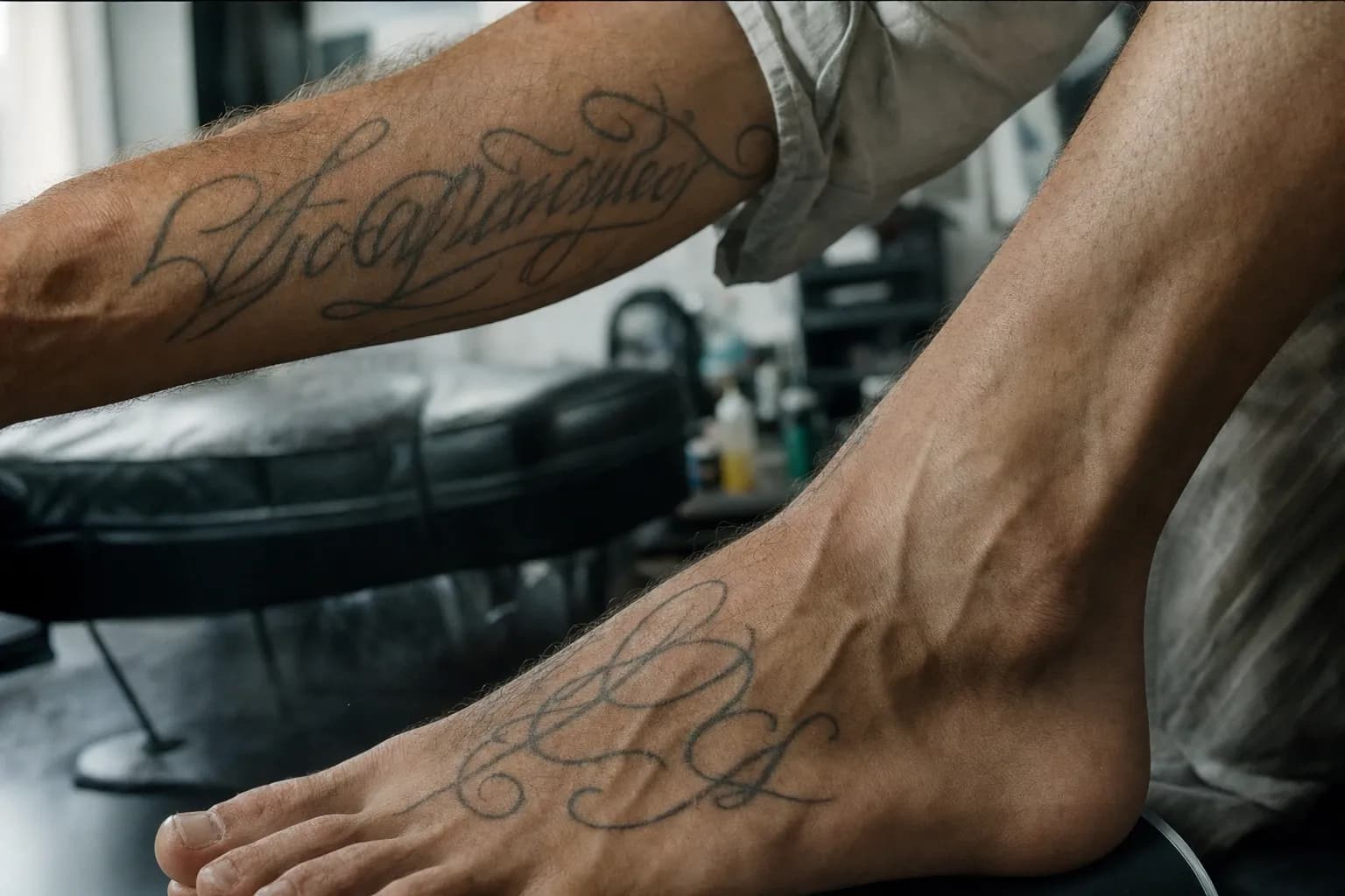
Fine script is executed with a single needle or a tight grouping of two or three needles. At that gauge, a 0.1mm wobble in a cursive loop shows up in the finished piece. You can't fix it with shading. You can't smooth it out in post.
Line weight consistency matters across the entire word, not just within individual letters. If the downstrokes vary in thickness from letter to letter, the word looks unstable even when nothing is technically misspelled. This is the difference between a fine script tattoo artist who understands calligraphic rhythm and one who's simply copying letterforms without understanding their internal logic.
"Words carry weight before anyone reads them. The way a line tapers, the way one letter flows into the next. That's the part most people don't notice consciously, but everyone feels."
What Lettering Tattoo Work Actually Involves
Typography vs hand lettering vs calligraphy
These three terms get used interchangeably, but they describe different things. Typography means working with existing typefaces. Fonts designed for print or screen, adapted to the needle. Hand lettering means drawing letterforms from scratch, treating each letter as an illustration in its own right. Calligraphy is the pen-stroke discipline, historically built around ink and nib, that informs the rhythm and weight distribution of most fine script work.
Good custom typography tattoo Portugal clients often request starts with hand lettering. The artist draws the letterforms specifically for your skin, your placement, and your phrase. A font printed at 12pt and scaled up rarely holds up on a curved surface under magnification. Custom-drawn letters account for the arc of a forearm, the narrowing of a wrist, the way skin stretches at the collarbone.
When you're searching for hand lettering tattoo near me, that distinction matters. Look for studios where the artist draws the lettering rather than applying a stencil cut straight from a font file.
How ink behaves in skin over time
All tattoo ink spreads. The pigment particles sit in the dermis (the layer beneath the outer skin), and as skin ages and regenerates, those particles shift very slightly outward. In abstract work, that migration often goes unnoticed. In fine script, it can make adjacent strokes merge into a single blurred band.
A skilled artist pre-compensates. Strokes are spaced with migration in mind. Letters are sized so that when the inevitable settling happens over five to ten years, the word remains legible. This is why minimum size matters: experienced practitioners generally agree that individual letters in fine script should be no smaller than 5 to 6mm in height to hold up over time. Below that, strokes begin to touch before the decade is out.
Needle gauge plays a role here too. A single needle produces the finest hairline strokes but creates the thinnest deposit of ink. For pieces where longevity is the priority, a slightly heavier gauge. A 3RL (three-round liner). Lays down a denser pigment deposit that resists spreading better. The choice depends on the style, the placement, and what the client values most.
Lisbon's humid summers add another variable. High ambient humidity slows the early drying phase of healing, which can affect how cleanly the lines settle in the first two weeks. The studio factors this in when advising on aftercare timing, particularly for clients getting tattooed between June and September.
How to Evaluate a Lettering Artist's Portfolio
What to look for in healed examples
Fresh tattoos always look crisp. The ink is dense, the edges are clean, and there's contrast. The real test is healed work. Any portfolio that shows only freshly-done pieces is an incomplete picture.
When you find healed photos, look at stroke weight consistency throughout the word, not just within individual letters. Check the baseline: does each letter sit on the same invisible line, or do some float slightly higher? Look at leading (the space between lines in multi-line pieces). It should feel deliberate, not cramped or loose at random.
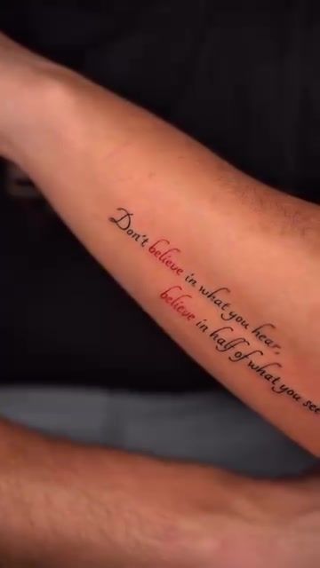
Also ask to see variety. A portfolio that shows only one script style repeated across ten pieces tells you the artist has found one thing that works and stays there. Strong lettering artists move between serif, sans-serif, and cursive scripts with equal confidence.
Red flags in a lettering portfolio
- Letters that lean at inconsistent angles within the same word
- Blurring between strokes on pieces described as fresh or recent
- No healed examples. Only freshly-done shots under studio lighting
- All pieces in a single script style, especially if it's the same phrase repeated
- Inconsistent baseline: letters that float or dip relative to their neighbours
- Swash flourishes (the decorative extensions on cursive letters) that collapse or thicken unevenly
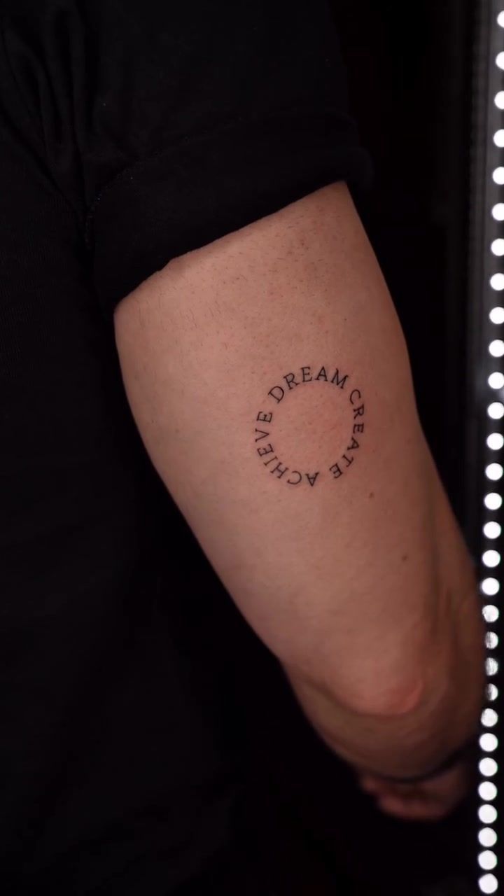
For more on what separates portfolio-worthy lettering from average work, the guide on what great lettering actually takes in Lisbon goes deeper into the craft specifics.
How the Studio Approaches Lettering Work
From phrase to placement
Every script tattoo Lisbon clients bring to the studio starts the same way: a conversation about meaning, not aesthetics. What does the phrase mean to you? Where did it come from? How do you want to feel when you read it in ten years? The answers shape every decision that follows, from the weight of the letterforms to the energy of the composition.
The artist sketches multiple versions of the letterforms before a stencil is ever cut. Not variations on a theme, but genuinely different approaches: a heavier serif version, a fine cursive version, a compressed sans-serif version. You see the options on paper before anything goes near your skin.
Placement shapes legibility in ways clients often don't anticipate. Text on the inner forearm reads naturally when your arm is relaxed. Text on the ribcage compresses and expands with every breath. Text on the collarbone sits on a surface that shifts with posture. The studio discusses these realities during consultation so the design is built around the placement, not just placed onto it.
Sizing and style decisions
Fine script below 5mm per letter height is a risk the studio is honest about. The letters may look beautiful the day they're done. By year three, adjacent strokes can begin to touch. By year five, readability depends on how well the ink was laid and how the individual client's skin has aged.
The studio also combines lettering with other disciplines naturally. This script and floral hand tattoo shows how botanical elements can frame words without competing with them, letting the text remain the focal point while the composition gains depth. For more on the full range of approaches, see the studio's lettering service.
Combining lettering with geometric elements works similarly. The precision required for clean geometric patterns shares a technical foundation with fine script. Both disciplines punish imprecision immediately and visibly, which is why the studio approaches them with the same methodical process.
Placement, Sizing, and What to Expect on the Day
Best placements for script tattoos
The forearm is the most popular placement for a reason. The surface is relatively flat, the skin is resilient, and the tattoo is easy to show or conceal depending on context. The collarbone is close behind. Elegant placement for shorter phrases, though the surface follows the bone's curve and requires the design to account for that arc.
| Placement | Surface quality | Pain level | Visibility | Longevity risk |
|---|---|---|---|---|
| Forearm (outer) | Flat, stable | Low to moderate | High | Low |
| Collarbone | Curved, over bone | Moderate | High (with neckline) | Low to moderate |
| Inner arm / bicep | Softer skin | Moderate to high | Concealable | Moderate |
| Ribcage | Moves with breath | High | Concealable | Moderate to high |
| Hand / finger | High-wear surface | Moderate to high | Very high | High (fades faster) |
Session length and aftercare
A short phrase in fine script typically takes 60 to 90 minutes, including stencil placement and any last-minute design adjustments. A full sentence or multi-line piece may need a two-hour session, or a second shorter appointment for final refinements. The studio won't rush a piece to fit a time slot.
- Keep the initial wrap on for three to four hours after the session ends.
- Switch to breathable film (second-skin bandage) for the first three days, or follow the specific guidance given at the appointment.
- After removing the film, apply a fragrance-free moisturiser twice daily. Nothing with alcohol, acids, or added scent.
- Avoid soaking the tattoo for the first two weeks. No long baths, no swimming in the Tagus or the sea.
- In Lisbon's summer heat, sweat can affect the healing surface. Keep the area clean and dry where possible, especially on hot days in Alfama or Príncipe Real where the humidity builds quickly.
- Don't pick peeling skin. In lettering tattoos, picking can pull pigment from narrow strokes and leave gaps that require touch-up.
For a broader look at what the precision work in this style demands technically, the article on what fineline tattooing in Lisbon really requires covers the shared technical ground between fine script and single-needle work.
Frequently Asked Questions
Will my lettering tattoo blur over time?
All tattoos spread slightly as skin ages, but lettering is more sensitive to this than abstract designs because illegibility is immediately obvious. Fine script placed too small, or with strokes too close together, will blur faster. A skilled artist accounts for migration when spacing and sizing the design from the start, pre-building the gap that spreading will eventually close.
How small is too small for readable script?
A general rule among experienced tattoo practitioners is that individual letters in fine script should be no smaller than 5 to 6mm in height to remain legible after healing and over years of wear. Below that threshold, strokes begin to merge. Your artist should flag this clearly during the consultation rather than agreeing to whatever size you request.
Can I get a lettering tattoo in a language the artist doesn't speak?
Yes, but the responsibility for correct spelling and meaning sits with you. Bring the text written out clearly, verified by a fluent speaker or an official translation. The studio will tattoo the exact characters you confirm in writing before the stencil goes on. A second set of eyes on the phrasing before that moment is always worth the effort.
Should I choose a specific font or let the artist design the letterforms?
Bringing reference fonts is useful and gives the artist a clear sense of your taste. But custom hand-drawn letterforms almost always produce a better result than printing a font directly. They account for the curve of your skin, the scale of the piece, and the way ink actually flows from a needle rather than a printer nozzle.
How do I find a good lettering tattoo artist in Lisbon?
Search for portfolio work that includes healed photos alongside fresh pieces. Look for consistency in stroke weight, clean spacing between letters, and variety across different script styles. A studio that specialises in fineline and lettering will understand the precision the style demands. Generalist shops that cover every style rarely go deep enough into any one discipline to do fine script well.