Why Spanish Lends Itself to Small Tattoos
The rhythm of the language
Spanish compresses meaning tightly. Where English might need eight or nine words to say something with weight, Spanish often lands it in four. That compression matters enormously once you start thinking about what fits on a wrist or collarbone without the letters becoming a blur.
The phonetic structure helps too. Spanish words tend to be vowel-rich and evenly stressed, which gives even a short phrase a natural cadence. You read it and feel it at the same time. That quality translates well to a small lettering tattoo, where the phrase needs to land immediately.
What makes a phrase tattoo-ready
Six words or fewer is a useful threshold. Beyond that, the letter height has to drop to fit a normal placement area, and once letter height drops below roughly 4mm on soft skin, fine strokes start to merge within a couple of years. Meaning gets swallowed by skin.
The best phrases carry emotional weight without needing explanation. A stranger reading your forearm shouldn't need a footnote. If you find yourself writing three sentences to justify why a particular phrase matters to you, the phrase probably isn't right for a tattoo. The right one tends to need about three words of explanation, not thirty.
"The phrase should do its job the moment someone reads it. If it needs context to land, it's doing too much work for something etched at 8mm."
Curated Spanish Quote Ideas and What They Mean
These phrases are grouped by emotional register. Most are short enough to qualify as minimalist tattoo work at wrist or collarbone scale. A few are drawn from recognisable literary and philosophical traditions; others are proverbs that have circulated in Spanish-speaking cultures for generations. None are invented here.
Philosophical and stoic
- Todo pasa. Everything passes. Four syllables. Works beautifully at small scale because the brevity mirrors the message.
- Carpe diem is Latin, but its Spanish equivalent vive el momento (live the moment) has genuine currency and fits a forearm cleanly.
- Lo que será. What will be. A fragment of the longer proverb, and the fragment is actually more powerful on its own. Sits comfortably in five letters of lowercase script.
- Sin miedo. Without fear. Two words. One of the cleanest options for behind-the-ear placement where space is genuinely tight.
- Nada es para siempre. Nothing is forever. Slightly longer at five words, but the rhythm is even and it stencils well across an inner forearm.
- Aquí y ahora. Here and now. A stoic reminder that has roots going back to Marcus Aurelius, whose ideas circulated through the Roman-Spanish world. Three short words with tonal balance.
Love, loss, and longing
Living in Lisbon puts you between two languages that share a preoccupation with longing. Portuguese has saudade; Spanish has añoranza. Both describe a kind of beautiful grief. That shared emotional register makes Spanish phrases about love and loss feel at home in this city.
- Te llevo en el alma. I carry you in my soul. Six words; this one sits at the upper limit of small lettering and works best at forearm width.
- Amor eterno. Eternal love. Two words. Compact enough for a collarbone piece or inner wrist. A meaningful Spanish phrase tattoo choice for memorial work.
- Duele, pero vale. It hurts, but it's worth it. Five words with a natural caesura after the comma that a skilled letterer can use rhythmically.
- Lo que el mar se llevó. What the sea took. Six words; references the Atlantic, which feels right for a Lisbon piece. Better suited to forearm or rib placement than wrist.
Nature and the everyday
- Florezco. I bloom. Single word. Works as custom lettering tattoos in a botanical script style, especially combined with a small floral element.
- Raíces y alas. Roots and wings. Three words with a visual contrast built into the meaning. Often attributed to Spanish poet Antonio Machado, though the phrase has passed into broader cultural use.
- La vida es breve. Life is brief. Four words, even syllable count. A phrase with Horatian roots that arrived in Spanish culture centuries ago and has never quite left.
Short single-word or two-word options
For the smallest placements, a single word carries more staying power than a cramped phrase. These work well for script tattoo fine line Lisbon clients who want something discreet but precise.
- Calma. Calm. Five letters, clean descenders, ages well in script.
- Vivir. To live. An infinitive used as an instruction. Five letters.
- Fuerza. Strength. Six letters with a strong phonetic weight that mirrors the meaning.
- Siempre. Always. Seven letters; a favourite for memorial pieces. Works in fine sans-serif at very small scale.
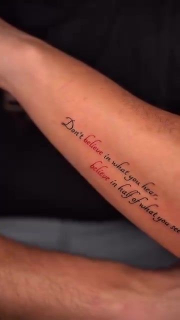
The Craft Behind Small Lettering Tattoos
Font choice and stroke width
Serif, script, and sans-serif fonts age differently on skin. Serifs. The small horizontal feet on letter endings. Can look refined fresh off the machine. But fine serifs below 5mm tend to fill in over time as the ink migrates slightly in the dermis. What was a clean letterform at six months can read as a thickened blob at five years.
Script fonts carry the most character but also the most risk. Thin connecting strokes between letters are the first to disappear. A skilled artist compensates by adjusting stroke weight before the design is finalised, not after the stencil is on your skin. Sans-serif options. Clean, unadorned letterforms. Hold the longest at small sizes, though they sacrifice some warmth.
Minimum readable size
Letter height below 4mm on soft skin areas (inner wrist, ribs, collarbone) tends to blur within two to three years on most skin types. The ink doesn't disappear; the edges spread. A phrase that read clearly at twelve months can look like a watermark at four years. Single-needle fineline work helps because the initial stroke width is finer, which gives slightly more margin before strokes merge.
Five to six millimetres per letter height is a more comfortable minimum for script on soft skin. For a phrase like todo pasa, that puts the finished piece at roughly 35-40mm wide. A very manageable size for an inner wrist or collarbone. For context, that's about the width of your thumb.
Placement and skin behaviour
Curved surfaces introduce alignment problems that flat paper never shows you. If the stencil sits 2mm off-centre on a collarbone, you'll see it every time you look in the mirror. The bone beneath creates a gentle ridge, and the skin moves differently on either side of it. A stencil that looks perfectly horizontal in the mirror can settle crooked once the client stands straight. Testing multiple placements before committing is not fussiness; it's the job.
Hands and fingers fade fastest. The skin on the sides of fingers regenerates more rapidly than almost anywhere else on the body, which means fine lettering there can lose legibility within months rather than years. The studio will flag this honestly at consultation. Some clients still want finger placement, knowing the trade-off. But it shouldn't be a surprise.
Lisbon's humid summers add a consideration specific to this city. Freshly tattooed skin in July or August, the two warmest and most humid months, is more vulnerable to infection and slower peeling if it gets damp repeatedly. For small lettering tattoos in particular, where fine strokes are still settling, keeping the piece dry and out of direct sun for at least the first two weeks matters. September and October sittings often heal more cleanly than August ones, all else being equal.
How the Studio Approaches Quote Tattoos
Consultation and type design
The studio draws custom typography for each client. The starting point might be a recognised typeface, but it's adapted: stroke weights adjusted, letter spacing (called tracking, in design terms) opened out to account for skin spread, and any accents or tildes positioned so they don't crowd adjacent letters. Lifting an unchanged font file and printing it as a stencil is a shortcut that shows up years later in the healed result.
For clients interested in the craft behind this, the article on what great lettering actually takes goes into detail on how type design for skin differs from type design for a page.
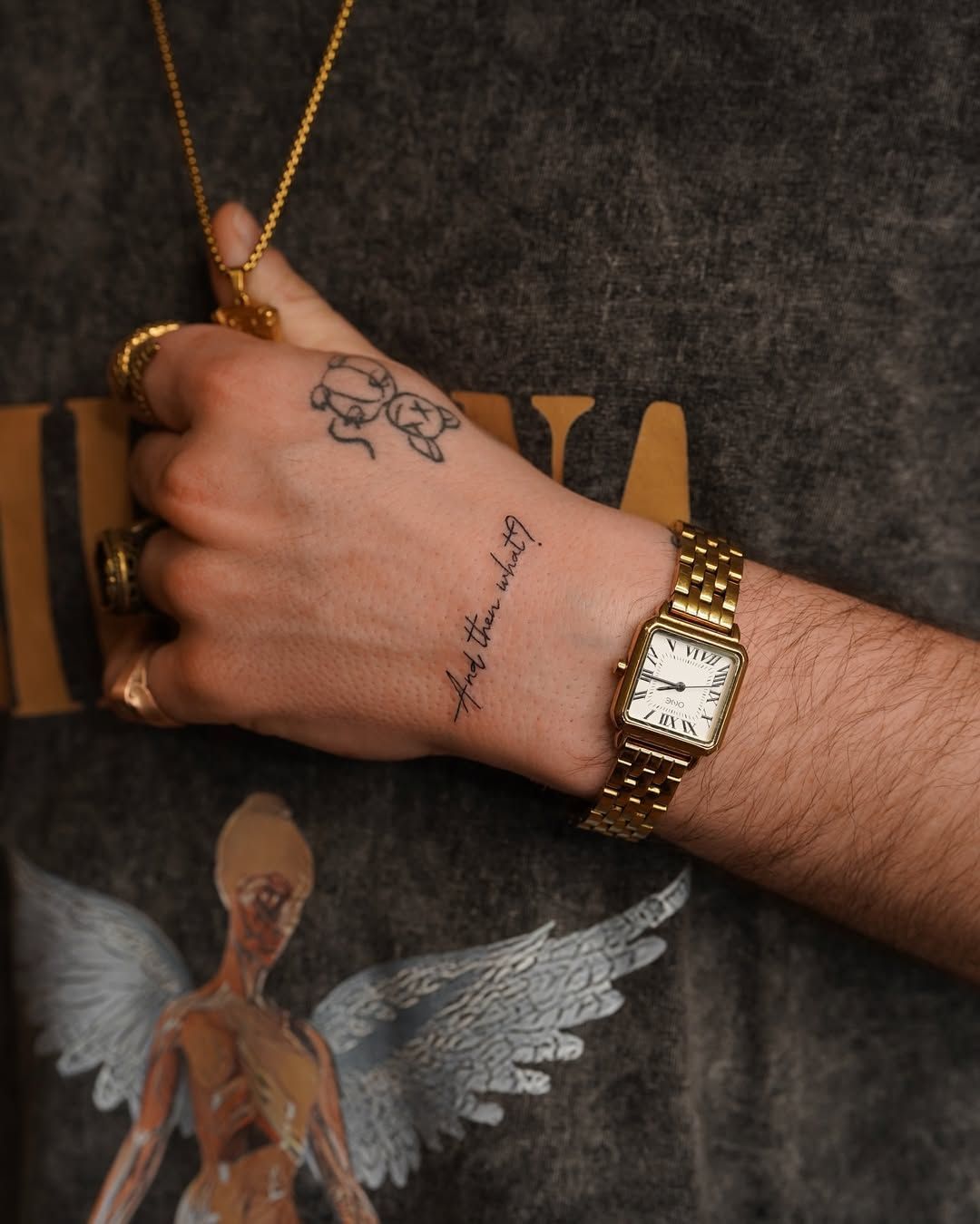
Sizing and placement session
Before anything is stencilled, the artist tests multiple print sizes. This is not a formality. A phrase that looks right at 80% scale on paper can feel too large once it's on the skin, or too small once the client sees it in context against their body. The stencil goes on, the client stands in front of the mirror, and adjustments happen before the needle comes near them.
Recommended placements for small Spanish quote tattoos, in order of longevity, run roughly as follows: inner forearm and collarbone hold the longest; inner wrist and sternum hold well; ribs keep detail cleanly but involve skin movement during healing; behind the ear works for single words or very short phrases. Hands and fingers are a different conversation entirely, handled case by case.
Practical Guide: Getting Your Spanish Quote Tattoo Right
What to bring to the consultation
Write the phrase out by hand and bring it with you. Include the English meaning. Also bring a note on the emotional context: why this phrase, why now. The artist doesn't need your life story, but understanding whether a piece is celebratory, memorial, or philosophical informs the typographic approach. A memorial piece in a calligraphic script reads differently from the same words in a clean sans-serif.
- The phrase written out in Spanish, with correct accents and tildes.
- The English translation and a sentence on what it means to you personally.
- Any reference images of script styles you like, even from non-tattoo sources.
- A clear idea of your preferred placement. Or an open mind if you're not sure yet.
- Clean, unlotion-ed skin on the placement area so the stencil adheres properly.
If you're considering a small lettering tattoo in Portugal, it's worth reading about why technique matters more than size before you arrive. Small work demands more precision, not less, and understanding that helps you ask better questions at consultation.
Sizing reference table
| Phrase length | Example | Minimum letter height | Typical session |
|---|---|---|---|
| 1-2 words | Sin miedo | 4-5mm | 45-60 min |
| 3-4 words | Todo pasa, calma | 5-6mm | 60-90 min |
| 5-6 words | Nada es para siempre | 5-7mm | 90-120 min |
| 7+ words | Te llevo en el alma | 6-8mm (forearm only) | 2+ hours |
Aftercare specifics for lettering
Fine letterforms need consistent moisture in the first ten days. The skin over thin ink lines dries out faster than it does over larger-area shading, and dry skin on a fresh tattoo leads to harder scabbing, which pulls pigment. A thin layer of unscented moisturiser twice daily is more effective than heavy bandaging past the first 24 hours.
In Lisbon between June and September, avoid direct sun on fresh lettering for at least three weeks. UV light degrades ink contrast faster than almost anything else, and fine script loses its crispness visibly after repeated sun exposure in the first healing month. No sea swimming for three weeks either. The salt water and sand are not kind to fresh ink, and Lisbon's easy beach access makes this a more relevant warning here than in many other cities.
For clients thinking about the bigger picture of sizing and style choices, the studio's approach to minimalist tattoo work covers how restraint in design often produces pieces that age more gracefully than busier alternatives.
Frequently Asked Questions
What is a good short Spanish quote for a small tattoo?
Phrases under six words work best at small scale. Strong options include todo pasa (everything passes), sin miedo (without fear), amor eterno (eternal love), and vivir (to live). Short phrases keep letter height large enough to stay legible as the tattoo ages, which is where most small quote tattoos eventually struggle.
How small can a lettering tattoo be before it becomes unreadable?
Most experienced artists won't go below 4-5mm letter height for script on soft skin areas like the inner wrist or ribs. Below that threshold, strokes begin to merge within a few years as ink settles in the dermis. Single-needle fineline technique gives slightly more room, but placement matters as much as needle gauge. The studio assesses both before committing to a size.
Should I include accents and tildes in a Spanish tattoo?
Yes, where the phrase is grammatically correct with them. Missing a tilde changes meaning in Spanish: aun (still, even) and aún (yet, still) are different words. At small sizes, accents need deliberate spacing allowance built into the design so they don't crowd adjacent letters. Discuss this at consultation so the stencil accounts for every mark before anything is tattooed.
Which placement lasts best for a fine-line script tattoo?
Inner forearm and collarbone tend to hold fineline lettering longest. Fingers and the sides of hands fade fastest because skin regenerates more rapidly in those areas. Ribs keep detail well but involve more movement during healing. The studio will advise based on the specific phrase length and your lifestyle rather than giving a one-size answer.
Do I need to speak Spanish to get a Spanish quote tattoo in Lisbon?
No, but verify the phrase with a native speaker before your consultation. Portuguese and Spanish are related but not identical, and small grammatical errors in a tattoo are permanent. Bring the phrase written out in full, with accents correct, and its intended meaning. The studio can flag concerns before anything is stencilled, but that check is most useful when you've already done your own verification.