Why Lettering Is One of the Hardest Styles to Do Well
Pick up any word and stare at it. Your brain parses it in under a second. That's exactly what makes lettering tattoos so demanding. Unlike a portrait or a floral piece, where the eye forgives organic variation, text has a rigid internal logic. A line 1mm too low, a letter spaced too wide, a stroke that thickens unevenly. You'll see all of it, every time you look.
Figurative work has hiding places. Lettering has none. The human brain is wired to detect asymmetry in written language before it consciously registers anything else, which is why searching for the best lettering tattoos near me deserves more thought than a quick scroll through Instagram.
Most clients only appreciate the quality gap after healing. In the chair, everything looks clean. Two months later, when the skin has settled and the ink has migrated slightly into the dermis (the deeper skin layer where tattoo pigment lives permanently), the difference between disciplined line work and rushed execution becomes very clear.
What Separates Good Script From Work That Degrades
Line consistency and needle weight
Fine script lettering typically uses a single needle or a 3RL configuration. A single needle is exactly that. One point, producing the thinnest possible line. A 3RL is a tight cluster of three needles arranged in a round liner formation, giving slightly more ink deposit and a touch more line stability. Both require slow, controlled hand speed. Rush either one and the line wobbles. Press too hard and the ink blows out, spreading beyond the intended boundary.
Ink density must stay uniform across every stroke. If one letterform gets slightly more pressure than its neighbour, it reads darker once healed. A phrase that looks balanced in the studio can read patchy six weeks later if density wasn't controlled from the first mark to the last.
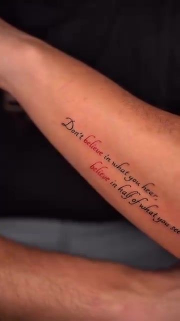
Spacing, kerning, and baseline control
Kerning is the space between individual letter pairs. In typography it's adjusted character by character. In tattooing, it has to be locked in via the stencil. A transfer of the design onto skin using a thermal paper template. Before the needle touches you. If the stencil drifts even 1mm off-centre on a curved surface like a forearm, you'll see it every time you look at the piece.
Baseline drift is a related problem. The baseline is the invisible line that letters sit on. On flat surfaces it's manageable. On a ribcage, collarbone, or wrist, the surface curves in multiple directions at once. An experienced artist maps the stencil around that curve before committing to placement, checking from multiple angles while you're standing, not just lying down.
Font choice and skin compatibility
Serif fonts. Those with small decorative feet at the ends of strokes, like Times New Roman. Have very fine thin strokes between their thick ones. In a digital file those hairlines are sharp forever. In skin, they can merge with the thicker strokes within three to five years, especially with sun exposure. That doesn't mean serifs are off the table. It means the minimum stroke weight has to be thick enough to survive the healing process.
Italic scripts with extreme contrast between thick and thin strokes carry the same risk. Sans-serif fonts (no decorative feet, more uniform stroke weight) tend to age more predictably. A good lettering tattoo Lisbon consultation addresses font longevity directly, not just how it looks in a reference image on a phone screen.
The Main Lettering Styles the Studio Works In
Fine script and fineline lettering
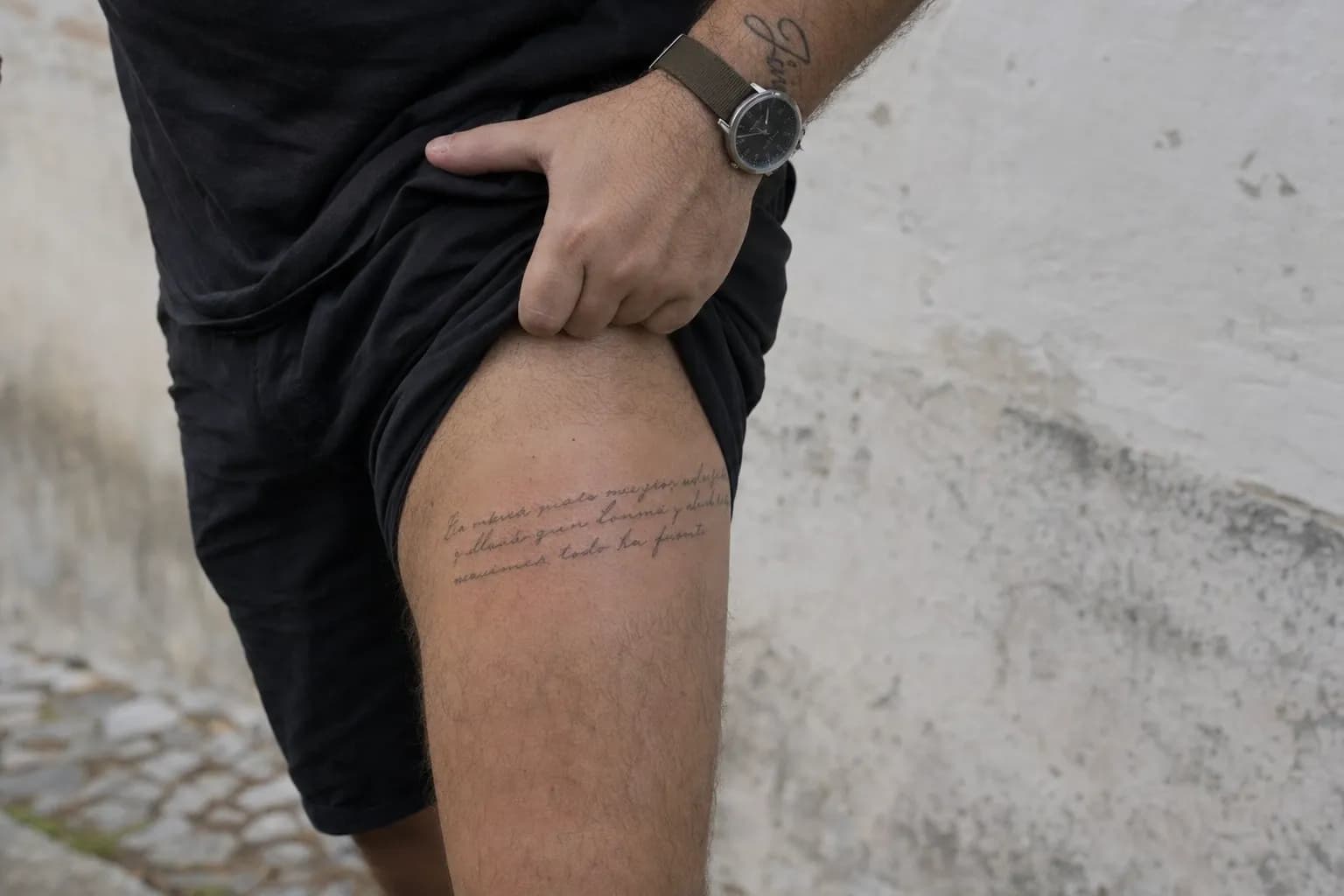
This is single-needle or 3RL work at its most precise. Flowing cursive, elegant italic, or restrained Roman capitals. The inner forearm is the classic placement: relatively flat, easy to read, and comfortable to show or conceal depending on context. For a thorough look at what this approach demands technically, the guide on what great script work actually takes covers the craft in detail.
Minimalist single-word pieces
One word, chosen carefully, placed with intention. The studio's custom lettering service handles these as seriously as any multi-element composition. Because a single word has nowhere to hide. Placement matters enormously here: wrist, collarbone, behind the ear, or the inner bicep all produce different visual weight and different healing conditions.
Circular and geometric lettering compositions
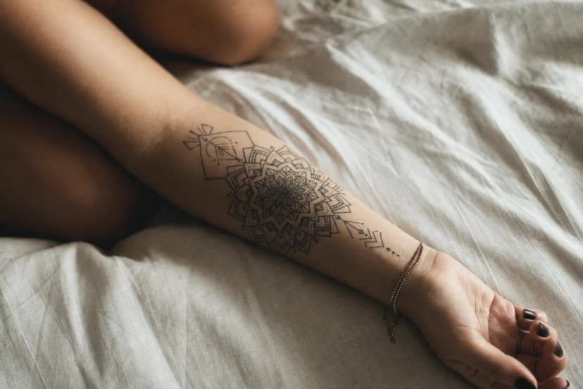
Text arranged in a circle, arc, or integrated into a geometric frame requires a second layer of spatial discipline on top of the lettering itself. Every letter must follow the same radius. The spacing has to compensate for the curve. Letters that look evenly spaced on a straight baseline will appear to crowd together on the inside of an arc if the spacing isn't optically adjusted.
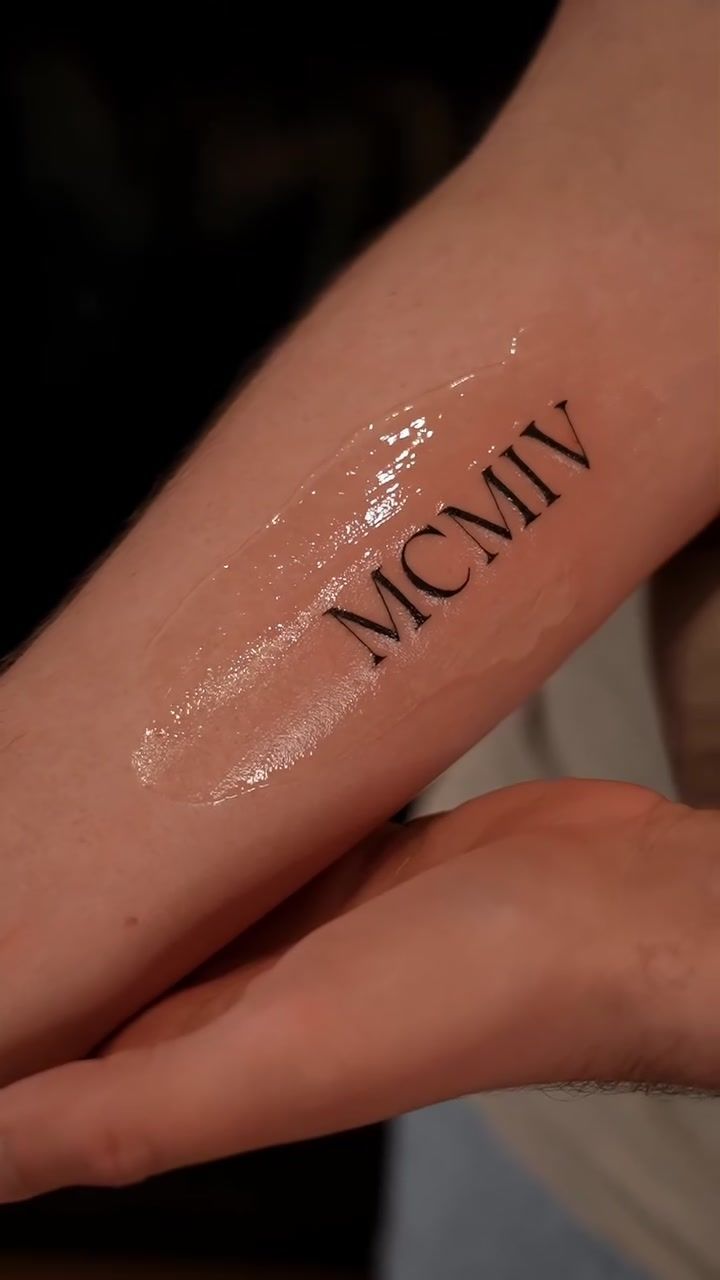
Roman numerals and dates are a good example of where typographic discipline matters even when the letterforms seem simple. Proportion between the M, C, V, and I characters. Each a different visual width. Has to be balanced deliberately, not guessed.
Mixed lettering and floral
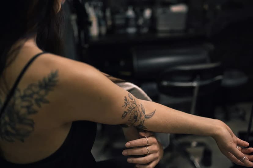
Script paired with botanical elements is one of the studio's most requested combinations. When it works, the two elements feel like they grew together rather than being placed side by side. The key is a shared line weight: if the floral stems are drawn at 0.3mm and the script strokes are twice as heavy, the piece looks like two separate tattoos. See how this balance plays out in these script and floral hand tattoos, where the botanical and lettering elements share the same fineline weight throughout.
How the Studio Approaches a Lettering Consultation
Bring a reference. It doesn't have to be perfect. A screenshot of a font you love, a photo of handwriting you admire, or a rough sketch of the layout you're imagining all give a concrete starting point. The studio works from what you bring, not from a blank page.
Font selection is collaborative, but there's always a practical filter applied. If a typeface you love has hairline serifs that won't survive the skin's healing process, the studio will adapt it: thickening the thin strokes, adjusting letter spacing, or suggesting a closely related font that behaves better long-term. The goal is a design that still looks like your vision five years from now, not just on the day.
"The best lettering consultations start with what you want to say, not which font you found online. Once we understand the meaning, choosing the right form for the skin becomes a much clearer conversation."
Custom lettering. Where the artist draws the letterforms from scratch rather than adapting an existing typeface. Takes longer in design but often produces work that feels more personal and sits more naturally on the body. It's worth discussing during your consultation whether a custom approach fits your timeline and concept.
Placement is decided before the stencil is prepared. The studio considers how the text will read from a standing position, how the surface curves at the chosen spot, and whether the design will interact with any existing tattoos. Once placement is agreed, the stencil goes on and you check it from multiple angles. Nothing begins until you've confirmed it's right.
If you're thinking about smaller placements. Wrist, behind the ear, inner ankle. The placement guide for smaller tattoos covers the practical trade-offs in detail.
Placement, Sizing, and What to Expect in a Session
The minimum letter height for fine script is around 5 to 6mm per character. Below that threshold, thin strokes. Particularly in serif or italic fonts. Begin to merge as the skin heals. A short phrase executed at the right size will always outlast a longer one squeezed in too small. This isn't a stylistic preference; it's a physical limit of how ink behaves in human skin.
- Wear or bring clothing that gives easy, unobstructed access to the placement area
- Eat a proper meal two to three hours before your session
- Avoid alcohol for at least 24 hours beforehand. It thins the blood and affects ink retention
- Moisturise the area daily in the week leading up to your appointment, but arrive with clean, dry skin on the day
- Bring your font references saved locally on your phone, not just as browser tabs that need a signal to load
| Placement | Typical session length | Healing notes |
|---|---|---|
| Inner forearm (short phrase) | 60. 90 minutes | Heals consistently; minimal sun exposure in daily life |
| Collarbone | 60. 90 minutes | Clothing friction can slow the first week; wear soft cotton |
| Ribcage | 90. 120 minutes | Skin moves with breathing; keep the area dry and loose-fitting |
| Wrist or inner wrist | 45. 75 minutes | High-movement area; avoid tight-cuffed clothing for 2 weeks |
| Behind the ear | 30. 60 minutes | Keep hair away from the area; avoid earphones for 10 days |
| Mixed lettering and floral (forearm or upper arm) | 2. 3 hours | More ink coverage means more aftercare attention in the first week |
Lisbon's summer humidity. Particularly in July and August when the air sits heavy around Cais do Sodré and Alfama. Adds a layer of complexity to fresh tattoo healing. Sweat softens the protective barrier that forms over new ink. Plan sessions for cooler mornings if possible, and avoid beach trips to Costa da Caparica or Cascais for at least three weeks after.
Aftercare Specifics for Lettering Tattoos
Dense lettering. Particularly longer quotes where the needle passes over the same area multiple times. Can leave the skin feeling more worked than a comparable-sized floral or geometric piece. Gentle care in the first 72 hours matters. Keep the area clean with fragrance-free soap, pat dry, and apply a thin layer of unscented moisturiser. Thin, not thick. Heavy application traps moisture and slows the skin's ability to breathe.
- Clean the tattoo gently twice daily for the first two weeks
- Apply a fragrance-free, alcohol-free lotion in a thin layer. Enough to stop tightness, no more
- Keep the area out of direct sunlight for a minimum of three weeks
- Once fully healed (six to eight weeks), apply SPF 50 whenever the tattoo will be exposed to sun
- Avoid soaking in pools, the sea, or baths during the healing window. Showers only
Fine script fades faster than bold blackwork because thin lines hold less ink volume. Sun is the single biggest accelerant. A lettering tattoo Lisbon clients wear through the long, bright Portuguese summer needs consistent SPF protection once healed, or the fine strokes lose contrast within a few years.
Touch-ups for script work are straightforward when caught early. If a letterform loses definition after healing. A thin serif that merged slightly, or a stroke that looks lighter than its neighbours. A single focused session can bring it back. Leaving it for years makes the correction harder. Book a review with the studio around the eight-week mark if anything looks uncertain after healing.
Frequently Asked Questions
How small can a lettering tattoo be?
For fine script, the practical minimum is around 5 to 6mm per character height. Below that, thin strokes. Especially in serif or italic fonts. Tend to merge together as the skin heals. A short word done at the right size will always look sharper and stay legible longer than a tiny phrase pushed past the threshold of what skin can hold cleanly.
Can I bring my own font to a lettering tattoo consultation?
Yes, and it's genuinely useful. A reference font gives a clear starting point for the design conversation. That said, not every typeface translates well to skin. The studio may adapt stroke weight or letter spacing to ensure it heals cleanly. The goal is a version of what you love that still looks right in five years, not just on the day.
Do lettering tattoos fade faster than other styles?
Fine script can fade faster than bold blackwork, mainly because thin lines hold less ink volume. Sun exposure is the biggest accelerant. Keeping fresh lettering out of direct sun for at least three weeks, then applying SPF 50 daily once healed, makes a measurable difference to long-term legibility. Touch-ups are straightforward when addressed early.
Where is the best placement for a script tattoo?
Inner forearm and collarbone are popular for good reason: both offer a relatively flat, stable surface and are easy to read. Ribcage and wrist are also common, though skin movement during healing can slightly affect fine lines. Placement is discussed thoroughly during consultation, considering the design's length, direction, and how it will sit on your specific anatomy.
How long does a lettering tattoo session take?
A short phrase on the inner forearm typically takes 60 to 90 minutes, including stencil placement and skin preparation. Longer quotes or mixed lettering-and-floral compositions can run two to three hours. You'll get a realistic estimate during consultation once the design and placement are confirmed. Session length depends on both scale and complexity.
Does script lettering work alongside other tattoo styles?
Absolutely, and it often produces the most personal results. Script pairs naturally with floral work, geometric borders, or fine line illustrative elements. The key is consistent line weight across all elements. If the letterforms and the surrounding work share the same visual weight, the finished piece reads as unified rather than a collection of separate ideas placed next to each other.