Why Lettering Is One of the Hardest Styles to Execute Well
The margin for error is smaller than you think
Pick up any book, look at a sentence on a page, and your brain processes the spacing and rhythm instantly. It does the same with tattooed text. The difference is that ink in skin can't be corrected with an undo key.
A floral piece with one slightly soft petal reads as artistic choice. A letter sitting 1mm too high in a word breaks the whole phrase's rhythm. Your eye catches it every time, even if you can't name exactly what's wrong.
Spacing, baseline consistency, and letterform weight all work together. When any one of them slips, the whole piece suffers. That's what makes the best lettering tattoo artist genuinely rare.
Why your eye knows immediately when something is off
Humans read text thousands of times a day. We're wired to notice when letterforms feel wrong. A floral that isn't botanically accurate can still look beautiful. A word with uneven kerning, which means the space between individual letters, looks like a mistake. Because it is.
This doesn't mean lettering tattoos should be avoided. It means they need an artist who understands typography as well as they understand skin. Those two things don't always come in the same person.
What Actually Makes a Lettering Tattoo Artist Stand Out
Drawn by hand versus printed and traced
Many artists download a font, print it at the right size, and transfer it directly to skin. It's faster. But a flat digital font wasn't designed for a rounded forearm or a collarbone that shifts with every breath.
A skilled hand lettering tattoo artist sketches the phrase directly, adjusting stroke weight and spacing to account for the body's actual curves. Letters that look evenly spaced on a flat page need subtle adjustments to read evenly on skin. That's the difference between a font and a custom letterform built for that body, that placement, that person.
For custom lettering tattoos at the studio, every piece starts as a hand drawing. No downloads, no clip art. The design is built from scratch to suit your phrase and your skin.
Needle gauge, machine choice, and line control
Fine script tattoo work uses a single needle or a tight 3-round liner. A single needle creates very thin, precise lines with almost no built-in margin for error. Move too slowly and the ink pools. Move too quickly and the line thins out or breaks.
Heavier calligraphic script, the kind with thick downstrokes and thin upstrokes, uses a slightly broader grouping: often a 5 or 7-round liner. More needles means more ink deposited per pass, which demands a different pressure and speed. Switching between the two within a single piece, as some scripts require, calls for real machine control.
This is why reading about what precision looks like in fineline work is worth your time before you book any script tattoo. The technical demands overlap significantly.
Script styles and what they each demand technically
- Cursive / Copperplate: Connected letters with hairline upstrokes and thick downstrokes. Beautiful, but hairlines thinner than 0.5mm risk spreading in soft skin.
- Serif: Letters with small feet at their terminals. Classic, readable, ages well when sized generously.
- Sans-serif: Clean, no terminals. Works well in minimalist pieces. Requires very even line weight throughout.
- Gothic / Blackletter: Dense, high-contrast letterforms. Needs more space to stay legible. A four-word gothic phrase on a wrist will close up within a few years.
The right style depends on your phrase length, your placement, and how the piece needs to read. At arm's length versus close up.
Common Mistakes in Lettering Tattoos (And How to Spot Them in a Portfolio)
Ink spread and why thin scripts are vulnerable
A blowout happens when ink is pushed beyond the dermis layer into the fatty tissue below. In a fine script tattoo, a blowout turns a clean hairline into a blurred smudge. It's irreversible without significant rework.
Blowouts in lettering often come from needles going too deep on soft skin, like the inner wrist or the inner bicep. You can spot the risk in a portfolio: look for halos of faint ink around thin letterforms in healed pieces. Fresh work almost always looks clean. Healed work tells you the truth.
Red flags to watch for in any portfolio:
- Uneven baseline, where letters bob up and down across the phrase
- Inconsistent stroke width within the same letter or across a word
- Letters touching or merging when the style calls for separation
- Fuzzy edges on healed thin-stroke work
- Only fresh photos available. No healed examples at all
Curved text on curved skin. The stencil problem
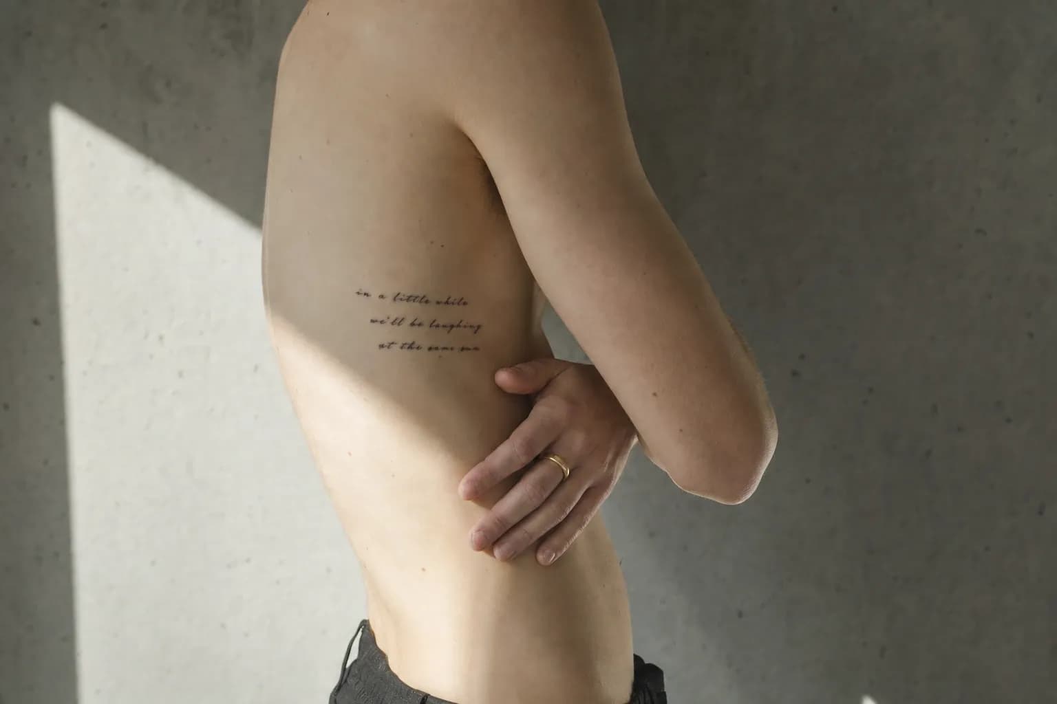
A stencil is a transfer of the design onto the skin before tattooing begins. Flat stencils applied to rounded surfaces distort. If the stencil sits 2mm off-baseline on a curved rib, the whole phrase tilts, and you won't notice until it's healed.
A careful artist will position the stencil with you standing in your natural posture, not lying flat on the table. They'll check alignment from multiple angles before a single needle touches skin. This is not a small thing. It's the kind of detail that separates rushed work from considered work.
For a deeper look at what to look for when evaluating any artist's lettering portfolio, the guide on what actually makes lettering work in Lisbon covers this in detail.
How the Studio Approaches Lettering Tattoos in Lisbon
The consultation and custom design process
The consultation isn't a formality. It's where the piece actually starts. The artist needs to understand the phrase, the placement, the size, the style direction, and your skin tone. All of these affect the design decisions before a single line is sketched.
After that, the lettering is drawn by hand. The artist maps out letter spacing for the specific length of your phrase, adjusts stroke weights to suit the placement, and accounts for how the area curves. You see the design before it goes anywhere near a stencil.
"Every phrase has its own rhythm. The job is to find a letterform that matches it, not force a font onto skin and hope it works."
This custom approach is particularly important for longer phrases. A quote running across a forearm has entirely different spatial demands than a single word on a collarbone. Each one gets its own drawing, its own spacing, its own weight distribution.
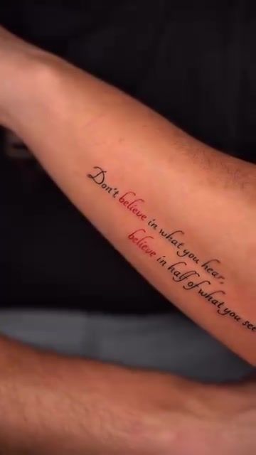
Placement advice specific to how scripts age
Lisbon summers are humid. From June through September, skin sweats more, heals differently, and fine-line scripts need more careful aftercare than they would in a drier climate. Keep the area moisturised, covered from direct sun, and away from salt water or pool immersion during the first six to eight weeks of healing.
Sun exposure during healing is the single biggest threat to a fine script tattoo in Portugal. UV light breaks down fresh ink before it has fully settled into the dermis. Even after healing, unprotected sun exposure accelerates fading in thin-stroke work. SPF on healed script is a simple habit that extends the life of the piece considerably.
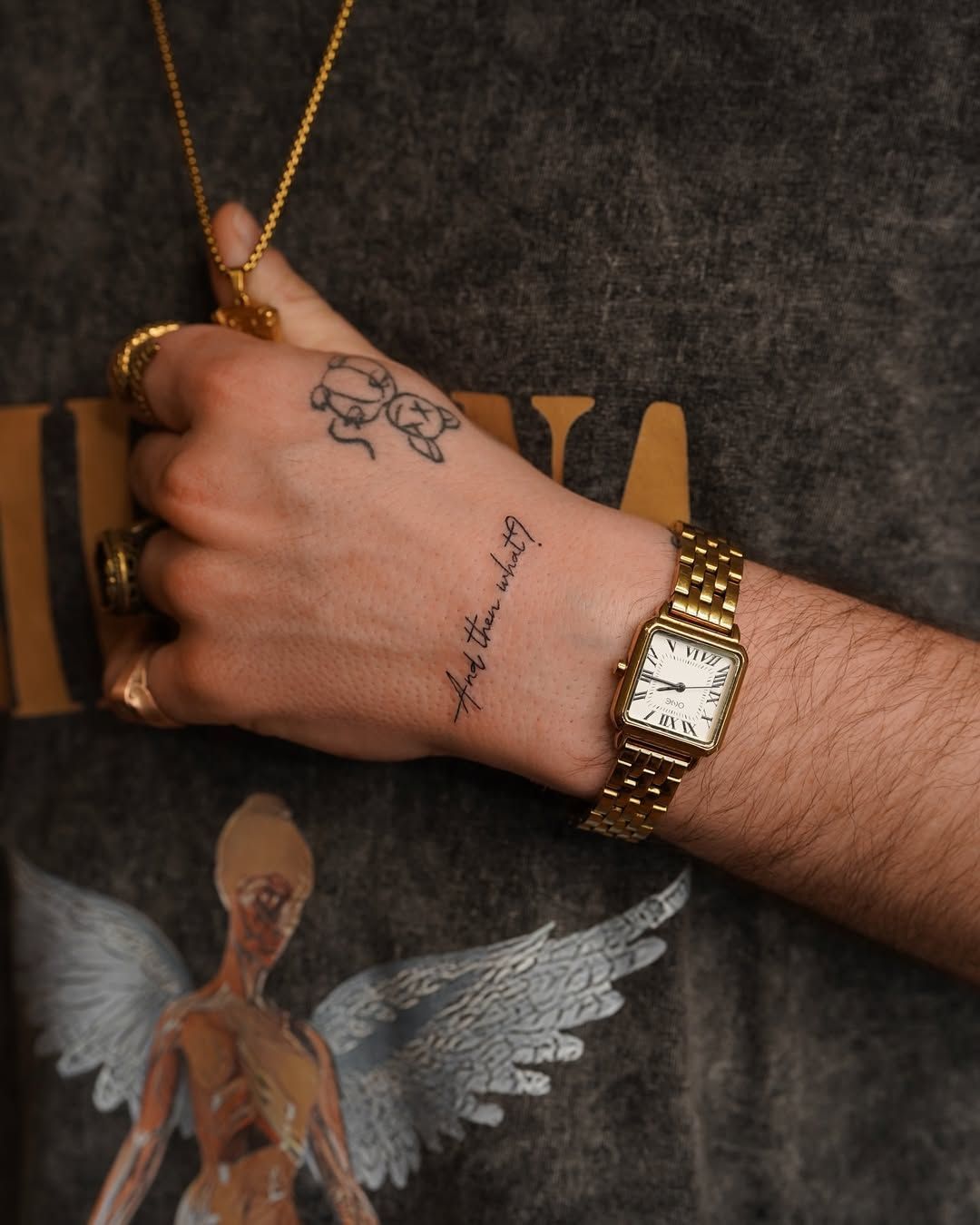
Hand placements, like the one above, are among the most demanding for longevity. Skin on the hand moves constantly, sees friction daily, and gets more sun than most other areas. That context shapes every design decision: letter size, stroke weight, and spacing all need to account for how the area will wear over time.
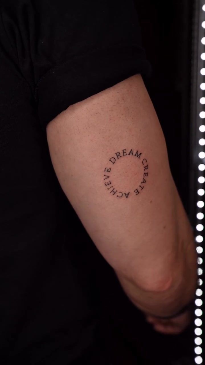
Sizing, Placement, and What to Expect in the Chair
Short phrases vs. Long quotes. What changes technically
A single word takes roughly 45 minutes to an hour, including stencil placement and positioning. A full forearm quote with a longer phrase can run to two hours or more. The time reflects not just tattooing but the alignment checks that happen throughout.
| Phrase length | Recommended placement | Approximate session time |
|---|---|---|
| One word | Collarbone, wrist, back of neck, ankle | 45. 60 minutes |
| Short phrase (3. 5 words) | Inner forearm, upper arm, sternum | 60. 90 minutes |
| Medium quote (6. 10 words) | Forearm, ribs, upper back | 90. 120 minutes |
| Long quote (10+ words) | Full forearm, ribs, back panel | 2 hours or more |
These are estimates. Skin type, placement complexity, and design detail all shift the actual time. A consultation gives a more accurate window for your specific piece.
Where lettering ages best on the body
Inner forearm and upper arm tend to hold fine script cleanest over time. The skin there has relatively low friction, modest sun exposure, and doesn't stretch significantly with weight changes. Upper back is similarly reliable for longer pieces.
Ribs and collarbone are popular. They're also technically harder. Rib skin moves with every breath, which affects how a stencil sits. Collarbone skin is thinner and closer to bone. Both can produce beautiful results, but they require an artist who knows how to adapt placement to movement.
Hands, feet, and the back of the neck fade faster. The skin renews more quickly in high-friction areas, which pushes ink toward the surface over time. This doesn't mean you shouldn't get lettering there. It means going in with clear expectations about maintenance.
What to bring to your consultation:
- The exact text you want, written out clearly. Spelling matters enormously
- Reference images of script styles you like, even from unrelated sources
- Font ideas if you have them. Useful for style direction, not for direct tracing
- A clear sense of placement and whether you want the piece to be visible or discreet
- Photos of your placement area in natural light, so the artist can assess skin tone and texture
For more on how placement decisions affect small and fine pieces specifically, the guide on what precision looks like in fineline work covers the overlapping technical considerations in detail. And if you're weighing up whether a fine script tattoo suits your vision, the full range of custom lettering tattoos at the studio shows what the style can achieve across different phrase types and placements.
Frequently Asked Questions
How do I know if a lettering tattoo artist is actually skilled?
Ask to see healed photos of script work, not just fresh pieces. Look for consistent baseline alignment, even stroke weight across each letter, and clean spacing between words. If a portfolio only shows fresh tattoos, that's worth noting. Healed work tells you how lines actually settle into skin. And that's the honest measure of craft.
What script styles work best as tattoos?
Cursive scripts, classic serif letterforms, and clean sans-serif styles all translate well when sized correctly. Gothic or blackletter requires more space to stay legible. The right choice depends on your phrase length, placement, and how you want the piece to read at a glance versus up close. A good artist will guide you through the trade-offs during consultation.
How long does a lettering tattoo take to heal?
Surface skin heals in roughly two to three weeks, but ink fully settles into the dermis over a longer window of around six to eight weeks. Fine-line scripts are particularly sensitive to sun exposure during this period. Keep the area moisturised, out of direct sun, and away from prolonged water immersion like pools or the Atlantic coast.
Can I bring my own font to the consultation?
Yes, and it's genuinely useful as a reference point for style direction. That said, a skilled lettering artist will redraw it by hand rather than trace a digital font directly onto skin. Body curves and skin texture mean a flat font file needs to be adapted to work properly as a tattoo. Bring it as inspiration, not as a final template.
Where on the body does lettering age best?
Inner forearm, upper arm, and upper back tend to hold fine script cleanest long-term. Areas with significant friction or sun exposure, like hands, feet, and the back of the neck, require more maintenance. Ribs and collarbone are popular placements, but the skin moves differently there, which affects both stencil placement and how the piece settles over time.