Why Script Tattoos Are Harder Than They Look
A flower petal that sits 2mm off-centre can read as artistic. A letter that sits 2mm off-centre reads as a mistake. That's the fundamental challenge of script tattooing, and it's why so many people regret choosing an artist who wasn't specifically skilled in lettering.
Unlike organic shapes, text carries cultural weight. Every person who sees your tattoo already knows what the letters should look like. An uneven baseline, inconsistent stroke weight, or a cramped kern between two characters is immediately visible to anyone who can read. There's no room to lean on the ambiguity that saves imprecise floral or abstract work.
That's not meant to discourage you. It's meant to set the right expectations before you sit down for a consultation.
What Makes Lettering a Distinct Craft
Typography vs hand-lettering: the difference matters
Typography is the arrangement of existing typefaces. Hand-lettering is the act of drawing each letterform from scratch, treating it as illustration. The best lettering tattoos are hand-lettered, not typeset. An artist who understands kerning (the spacing between individual letters), x-height (the height of lowercase letters relative to capitals), and stroke contrast (the variation between thick and thin parts of a letterform) will produce work that holds together visually in ways a simple font transfer never will.
When you read about what great lettering actually takes, the consistent thread is craft knowledge built over years of practice on skin. Not just on paper.
At this studio, no font is pulled off a computer and placed directly on skin. Every piece is redrawn to suit the body part, the skin tone, and the scale. That process takes longer. It produces better results.
How ink behaves differently in fine script vs bold text
Needle gauge changes everything here. A single needle lays hairline serifs (the small finishing strokes at the ends of letters) with precision, but it demands a confident, controlled hand. Move too fast and the line thins unevenly. Go too deep and ink spreads beneath the skin. A blowout that turns a crisp serif into a blurred edge.
Heavier blackletter strokes, by contrast, use a slightly broader configuration and tolerate a little more variation in pressure. The risk shifts: bold script that's inked too densely in a small space will merge and muddy over the years as the ink settles into the dermis.
Knowing which needle to reach for. And when to switch mid-piece. Is what separates a lettering tattoo service grounded in real craft from one that just traces fonts.
What to Look for in a Script Tattoo Portfolio
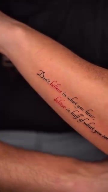
Healed examples vs fresh work
Fresh tattoo lines look sharp on almost anyone. The skin is still raised, the ink sits near the surface, and a photo taken the same day flatters even mediocre work. Ask specifically to see healed examples. Pieces that are six months old or older. That's where you'll see the truth about how an artist's lines hold.
Hairline serifs that blur into the surrounding skin after healing reveal either incorrect depth, wrong placement, or both. Bold strokes that spread and merge show that the artist didn't account for ink migration over time. A portfolio full of only fresh photos isn't a red flag on its own, but it's worth asking the question.
Consistency across multiple pieces
Look at the baseline across every letter in a phrase. In cursive, the letters will rise and fall. That's expected. But they should rise and fall in a controlled rhythm, not randomly. Look at the spacing. Letters that bunch together in one spot and stretch apart in another suggest the artist is tracing rather than drawing.
Also look at the range of styles on offer. Serif, sans-serif, cursive, blackletter, hand-lettering with decorative flourishes. An artist who can only produce one style of script has limited experience. The best lettering tattoo artists in Lisbon should be comfortable shifting between a clean, minimal print phrase and an ornate flowing script, and the portfolio should show both.
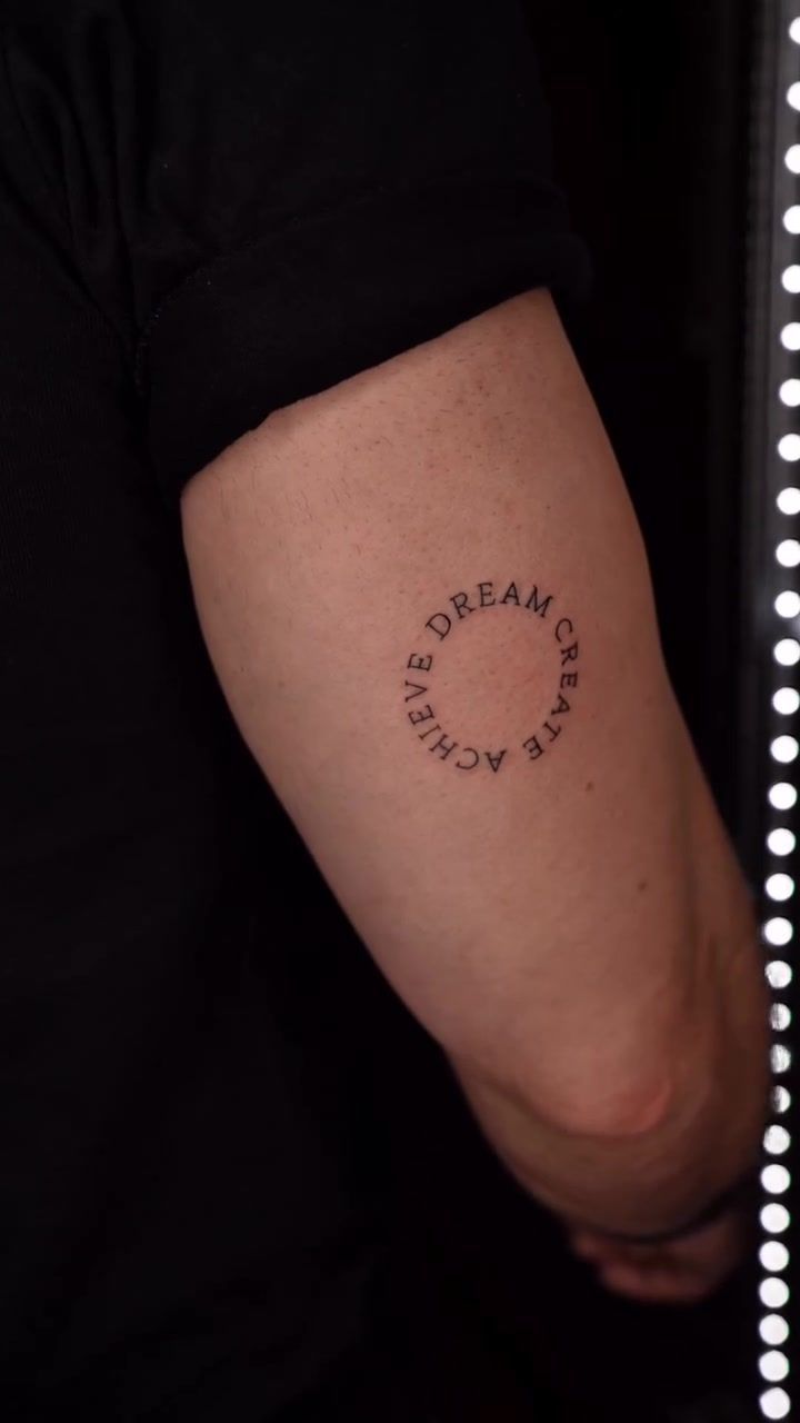
How the Studio Approaches a Script Consultation
The stencil conversation
The stencil is where a script tattoo either succeeds or fails before a needle touches skin. At this studio, the stencil review happens in multiple positions. You'll be asked to stand with the limb relaxed, then extend it, then rotate it. For a forearm piece, that means checking how the text reads when your arm hangs naturally at your side and when it's extended palm-up on the armrest. The letters need to work in both.
If the stencil sits even slightly off the natural flow of the arm's curve, a straight-looking baseline in the mirror becomes a visibly crooked one when worn. That's a correction that takes two minutes before inking and is impossible to fix after.
"The stencil isn't a formality. It's the most important conversation we have before any session starts. And it's the moment where a good artist will tell you honestly if your chosen placement needs to change."
Placement and skin behaviour in Lisbon's climate
Lisbon's humid summers create a specific challenge with stencil transfer. When skin is warm and slightly damp. Which is most of July and August. Stencil ink can sit differently on the surface, sometimes transferring less crisply than in cooler conditions. The studio adjusts for this: skin is prepared carefully before transfer, and extra time is given to let the stencil fully set before beginning.
Curved surfaces need special attention too. A collarbone, a forearm, a ribcage. These all require adjusted letter spacing so the text reads correctly when the body is in its natural resting position. Letters spaced evenly on a flat stencil will compress on the inner curve and stretch on the outer one. An experienced hand lettering tattoo artist in Lisbon accounts for this in the drawing stage, not as an afterthought.
Placement, Size, and Longevity: Practical Decisions
Fine script tattoo lettering has minimum size thresholds. And those thresholds come from watching healed work over years, not from theory. Hairline serif letters need to be at least 6-7mm tall to hold their detail for a decade. Bold sans-serif letters can be slightly smaller, around 5mm, because there are no delicate finishing strokes to blur. Going smaller than these thresholds is possible, but be prepared for touch-ups sooner.
Sun exposure in Lisbon is significant for most of the year. UV light breaks down black ink pigment faster than almost anything else. Once your script tattoo is fully healed. Usually around three to four weeks for fine line work. SPF 50 sunscreen on the area every time you're outside is non-negotiable if you want the ink to stay legible over time.
| Placement Zone | Longevity for Fine Script | Recommended Min. Letter Height | Notes |
|---|---|---|---|
| Outer forearm | Excellent | 5-6mm | Low friction, stable skin tension, easy to show and protect |
| Upper arm | Excellent | 5-6mm | Consistent surface, ages very well |
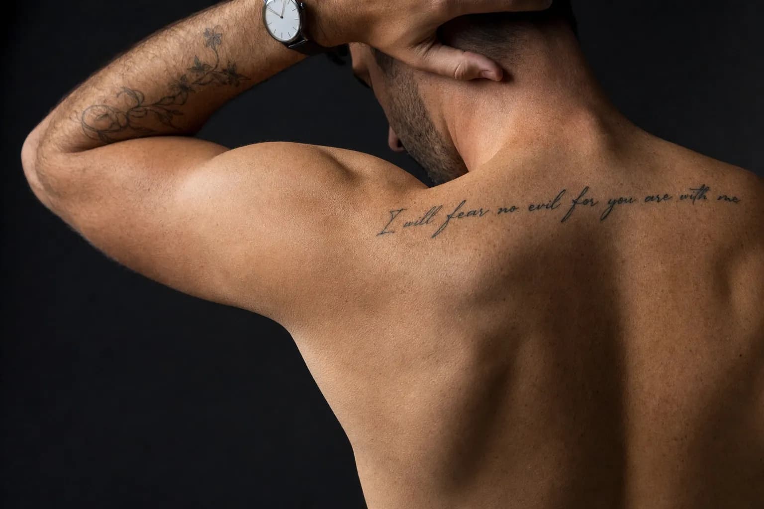
| Upper back / shoulder blade | Very good | 6mm | Less sun exposure, but harder to monitor healing yourself |
| Collarbone | Good | 6-7mm | Curved surface requires adjusted spacing; can rub against clothing |
| Inner wrist | Moderate | 6-7mm | High movement, frequent friction, fades faster |
| Ribcage | Moderate | 7mm+ | Skin stretches with breathing; spacing must compensate |
| Fingers | Poor for fine script | Not recommended for hairline serifs | Constant movement and washing; touch-ups often needed within a year |
The studio's script and floral hand tattoo is a good example of ambitious placement done with full awareness of the risks. Hand placement looks striking, but it requires accepting a different maintenance relationship with the piece compared to a forearm tattoo.
If you're looking at how similar considerations apply in single-needle work more broadly, the guide on what to look for in a fineline artist covers the overlap between fine script and fineline technique in useful detail.
Preparing for Your Session
Good preparation makes a noticeable difference to how the session goes and how the tattoo heals. Here's what the studio recommends:
- Bring reference images of typography you respond to. Not just fonts. Books, album covers, old signage, handwritten notes. The mood and weight of the lettering matters as much as the style.
- Eat a full meal about two hours before your appointment. Tattooing on an empty stomach makes the body's stress response sharper.
- Wear loose clothing that gives easy, unobstructed access to the placement area. If you're getting a forearm piece, a loose short-sleeved shirt is ideal. For a collarbone piece, a wide-neck top saves awkward repositioning.
- Avoid alcohol for at least 24 hours before your session. It thins the blood and makes clean line work harder for the artist.
- Moisturise the area daily for the week before your appointment. Hydrated skin takes ink more evenly than dry skin.
A phrase-length piece on the forearm typically runs 1.5 to 3 hours of needle time, depending on the complexity of the lettering style. Add 20 to 30 minutes for stencil review and positioning before the artist begins. For a longer quote or a more elaborate custom lettering tattoo with decorative elements, budget for a 3 to 4 hour session.
Aftercare for fine script is straightforward but specific:
- Keep the protective film wrap on for 24 hours after leaving the studio.
- Wash gently with unscented soap and lukewarm water, twice a day, for the first two weeks.
- Apply a thin layer of unscented moisturiser once the skin is dry. Don't over-saturate. A thin coat is enough.
- Avoid direct sun exposure for at least three weeks. After that, SPF 50 every time the tattoo is exposed outdoors.
- Don't pick or scratch peeling skin. Fine script lines sit close to the surface during healing. Picking pulls ink out.
Lisbon's humid summer air can slow the surface drying phase of healing. If the tattoo feels more moist than expected in the first week, a very light pat-dry with a clean paper towel after washing helps. Don't use cloth towels. The fibres catch on healing skin.
Frequently Asked Questions
How small can a script tattoo be and still be readable in 10 years?
Generally, individual letters in fine script should be at least 5-6mm tall to stay legible over a decade. Thinner serifs need more space than bold strokes. Placement matters too. High-movement areas like fingers blur faster. An experienced lettering artist will advise you on the minimum safe size for your chosen style and placement.
Is cursive or print lettering better for a tattoo?
Neither is universally better. Cursive flows naturally with the body's curves but requires a skilled hand to keep consistent spacing. Print letters are easier to read at a glance and age more predictably. The right choice depends on the mood of the piece, the placement, and the size. Your artist should advise based on all three factors together.
How long does a script tattoo session take?
A short phrase on the forearm typically takes 1.5 to 2.5 hours of needle time. Longer quotes, more complex lettering styles, or curved placements like the ribcage can extend that to 3 or 4 hours. The stencil review and placement discussion add 20 to 30 minutes before needlework begins. Factor that into your day when planning.
Can I bring my own font or text idea to the consultation?
Yes, and you should. Reference images of typography you love. From books, signage, even a screenshot. Give the artist a clear sense of the weight, mood, and style you're drawn to. The artist will then redraw the lettering specifically for your skin and placement, so the final design won't be a simple font paste-up.
Which body placement holds lettering best over time?
The outer forearm, upper arm, and upper back are the most stable placements for script tattoos. These areas have consistent skin tension and lower daily friction. Fingers, inner wrists, and ribcages fade faster. They're not impossible placements, but they may need a touch-up sooner than you'd expect. Sometimes within the first two years.