Why Lettering Tattoos Are Harder Than They Look
People often assume lettering is the easier end of tattooing. It's just words, right? In practice, it's one of the most technically demanding styles in the craft. A misplaced serif, a baseline that dips two degrees, a letter that's slightly too wide. Each of these is immediately visible and permanent. There's no background detail to draw the eye away.
The margin for error is almost zero
When you search for the best lettering tattoo shops near me, what you're really asking is: who has the needle control and the typographic literacy to do both jobs at once? Those are separate skills. A brilliant portrait artist may struggle to keep consistent letter spacing across a six-word phrase. The letterforms have to flow as a system, not as individual characters.
Consider tracking. The even horizontal spacing between letters in a word. Get it slightly wrong at the stencil stage and healing will amplify the error. Skin swells, then settles. A gap that looked fine fresh can collapse or widen as the dermis heals over six to eight weeks. A phrase that read clearly on day one can read differently by week ten.
Why most shops get it wrong
The honest answer: most studios treat lettering as a secondary service. They'll take the booking, drop a downloaded font into a stencil, and apply it without accounting for body contour, skin tone, or placement movement. The result ages badly. Fine lines in a script merge when placed on skin that flexes. Fingers, ribs, the inside of the wrist. Bold weight letters survive; ultra-thin strokes on a moving surface don't.
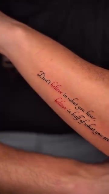
What to Actually Look For in a Lettering Tattoo Studio
Portfolio specificity: do they show lettering work, or just claim it?
Any studio can list lettering as a service. What matters is whether they show it. Specifically, whether they show healed lettering. Fresh photographs flatter almost any tattoo. Healed images reveal whether the lines held, whether spacing stayed consistent, and whether the piece reads legibly at a natural viewing distance.
When you're evaluating a hand lettering tattoo studio, look for variety in the lettering portfolio. Script styles, serif styles, all-caps. Different placements. Different skin tones. If every example is the same thin script in the same placement, that's a limited range. Not evidence of mastery.
Consultation depth: do they ask about font weight, tracking, and skin tone?
A lettering tattoo artist worth booking will ask where the text will live on your body before they discuss anything else. Placement dictates everything: character height, stroke weight, whether the design needs to curve. If a studio jumps to style options before understanding placement, that's a flag.
Good consultations cover font weight (how thick each stroke is), tracking, and how your skin tone affects black ink contrast over time. Pale skin shows grey ink; olive and darker tones need denser black to hold legibility. A confident lettering tattoo artist in Lisbon will tell you this unprompted.
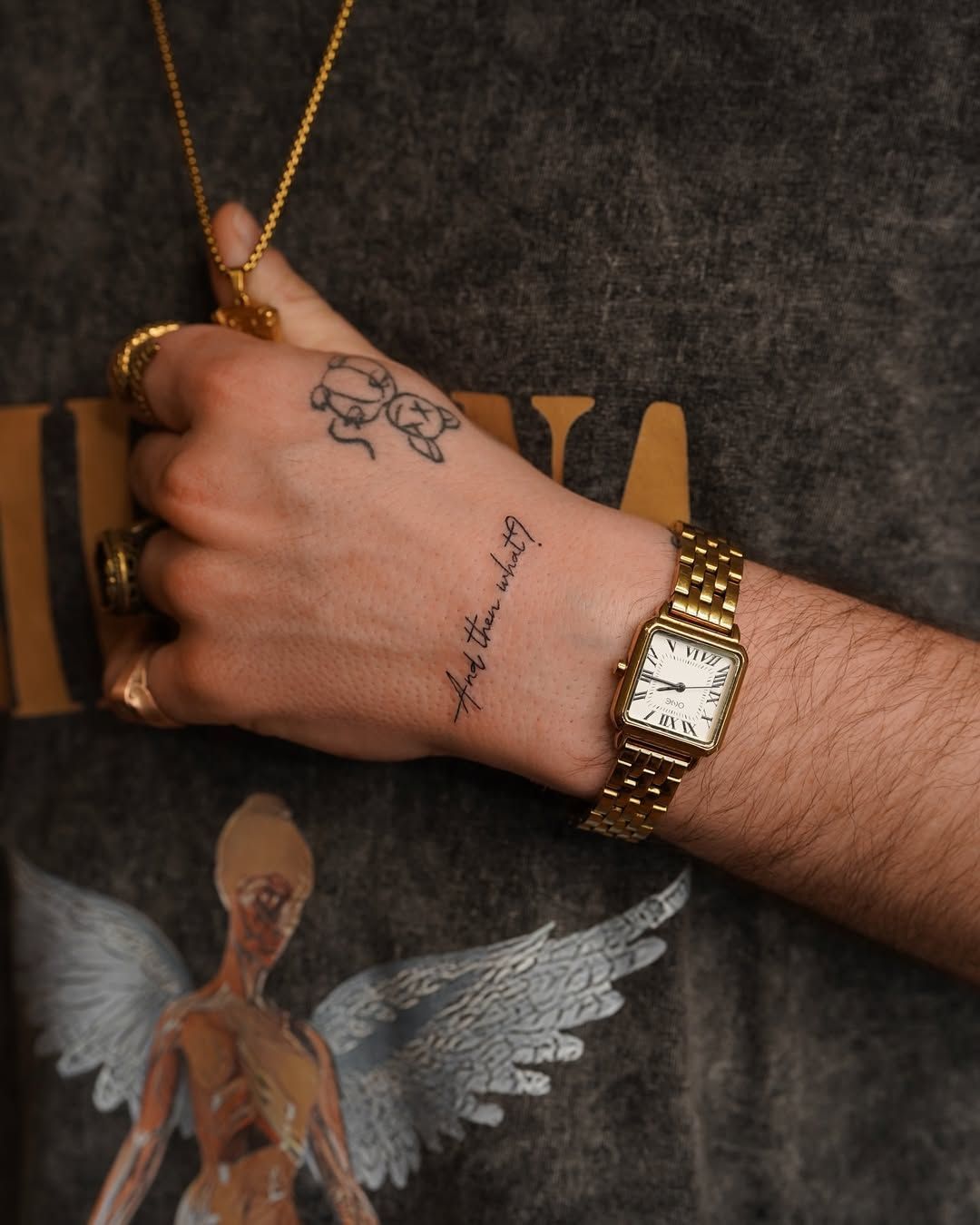
The difference between printed fonts and custom hand-lettering
A printed font is designed for a flat screen or page. Your body isn't flat. An arm curves. A collarbone has its own arc. Custom hand-lettering means the letterforms are drawn specifically for the placement. Adjusted so they read correctly when the limb is extended in a natural position, not just when viewed from directly above on a flat surface.
This distinction matters enormously for script tattoo Lisbon clients who want something that holds up for decades. Off-the-shelf fonts can work, but they require significant manual adaptation. Studios that skip that step are cutting corners that show up at the six-month mark.
- Ask if the studio draws letterforms from scratch or adapts existing fonts
- Request to see the digital design before stencil printing, not just at placement
- Check whether the design accounts for the natural curve of your specific placement area
- Look at how the letters connect in cursive work. Joins should flow, not jolt
For a deeper look at what distinguishes strong from weak script work, the studio's guide on what great lettering actually takes covers the technical ground in more detail.
How the Studio Approaches Lettering in Lisbon
From brief to bespoke: the design process
The studio designs every piece of lettering from scratch. No stock fonts dropped in unchanged. The artist starts with the text itself, then maps the layout to the actual contour of the placement area. A phrase that works as a straight line on a forearm may need to arc slightly on a collarbone to read correctly when the client stands upright.
Stencil placement takes longer than most clients expect. Sometimes 20 to 30 minutes for a single phrase. That time isn't padding. Getting the baseline level and the curvature right before the needle touches skin is the whole game. Once ink goes in, there's no editing.
Lisbon has its own visual tradition worth drawing from. The azulejo tile inscriptions in Alfama, the decorative lettering on old shopfronts in Príncipe Real. There's a Portuguese typographic heritage that occasionally inspires how the studio frames a custom typography tattoo. Not copying it, but absorbing the weight and balance of letterforms that have lasted centuries on ceramic and stone.
Pairing lettering with other styles (fineline, floral, geometric)
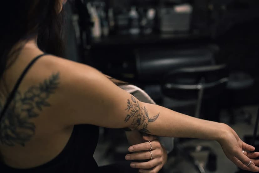
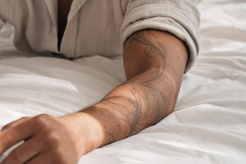
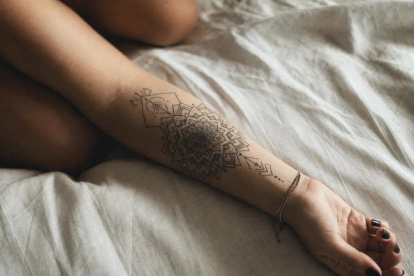
Lettering works well alongside other styles when it's planned that way from the start. The studio regularly combines script with fineline florals, geometric framing, or minimalist linework. The key word there is "alongside". Not bolted together as two separate designs sharing a space.
A good example of geometric integration is this circular lettering design, where the text follows a geometric path and the negative space is part of the composition. The words and the form work as one piece, not two ideas fighting for the same skin.
For clients interested in pairing lettering with botanical elements, the studio's lettering tattoo service page outlines how these combinations are approached at consultation stage.
Placement, Size, and What Happens After the Needle
Which placements hold lettering best
Placement is where most lettering tattoos are won or lost before the session even begins. Forearm skin is relatively stable and holds fine script well over time. The inner forearm surface is flat enough for straight baselines and doesn't flex dramatically during normal movement.
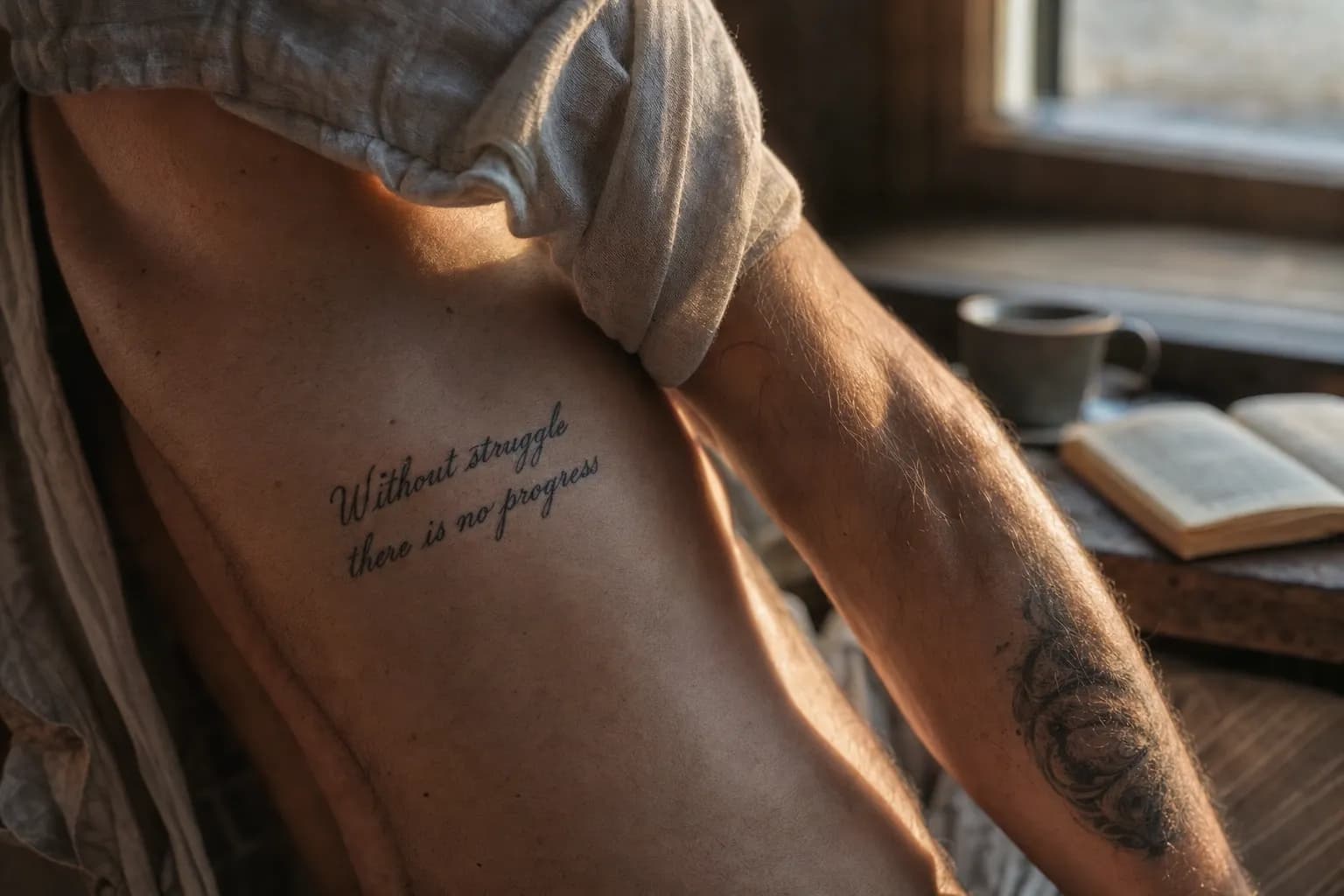
The ribcage is a different story. It flexes with every breath, every twist. Fine single-needle scripts on the ribcage will soften faster than the same text placed on a less mobile surface. That doesn't make it a bad placement. Just one that needs bolder stroke weight to compensate. The collarbone sits somewhere between the two: moderate movement, moderate longevity.
Fingers and wrists are the most demanding placements for any script work. Skin there regenerates quickly and is in near-constant motion. A fine script tattoo near me query that ends with a booking for finger lettering is one where the client should go in with realistic expectations about touch-up frequency.
How Lisbon's climate affects lettering healing
Lisbon summers are warm and humid, especially in Alfama and Cais do Sodré where heat reflects off cobblestone and old stone walls. That humidity slows the outer skin layer from drying normally during the first two weeks of healing. Fresh lettering on exposed areas needs to be kept out of direct sun entirely. Ultraviolet exposure on a healing tattoo can break down ink pigment before it's fully settled into the dermis.
After healing, black ink lettering on exposed placements. Forearm, collarbone. Fades faster in Lisbon's sun than in a northern European climate. SPF 50 on healed script is a practical necessity here, not an overcautious suggestion.
Size vs legibility: the table
The minimum recommended character height for single-needle script work is around 8mm per letter. Below that, fine strokes can merge during healing, turning crisp letterforms into blurred shapes. The table below gives a practical reference for placement, longevity, and typical session time.
| Placement | Skin Stability | Min. Recommended Letter Height | Typical Session Length | Longevity (with care) |
|---|---|---|---|---|
| Inner forearm | High | 7-8mm | 60-90 min | Excellent |
| Collarbone | Moderate | 8-10mm | 75-120 min | Good |
| Ribcage | Low-Moderate | 10-12mm | 90-150 min | Moderate (bolder weight holds better) |
| Wrist | Low | 9-11mm | 45-75 min | Fair (touch-ups likely within 3-5 years) |
| Fingers | Very Low | 6-8mm (very limited) | 30-60 min | Poor without regular touch-ups |
For a broader look at how placement decisions affect small-scale tattoos beyond lettering, the studio's placement guide for smaller tattoos covers adjacent considerations in useful detail.
Practical Guidance Before You Book
"The text is yours to decide. The layout, the weight, the way it sits on your skin. That's the craft. Come in with the words settled and we can build something that lasts."
The most common source of session delays isn't needle speed or stencil complexity. It's clients arriving undecided on the exact wording. Changing one word alters spacing, rhythm, and sometimes the entire layout. Settle the text before your consultation. Not as a draft, as a final decision.
- Bring printed font references, not phone screenshots. Screen resolution distorts fine details that matter at tattoo scale.
- Know the exact text before you arrive. Two near-identical options are fine; an open question isn't.
- Ask specifically to see healed photos of previous lettering work, not just fresh pieces from the day of tattooing.
- Wear or bring clothing that fully exposes the placement area. A collarbone design done through a stretched neckline will shift.
- Hydrate well the day before. Well-hydrated skin is more elastic and takes ink more evenly. This matters especially for fine script where stroke consistency is everything.
- Avoid alcohol the night before. It thins the blood and causes more bleeding during the session, which can push ink out of fine lines as they're being laid.
Frequently Asked Questions
How small can a lettering tattoo be and still look clean?
Individual letters in a script tattoo should be at least 7-8mm tall to survive healing without the lines merging. Single-needle specialists can push slightly smaller on stable, low-movement skin. But the placement has to earn it. Fingers, wrists, and ribcage all demand larger character heights to compensate for movement and faster skin turnover.
How long does a lettering tattoo session take?
A short phrase on a forearm placement typically runs 60 to 90 minutes. Longer quotes, circular arrangements, or text combined with illustrative elements can stretch to two or three hours. The design and stencil placement stage often takes longer than clients expect. Plan for it rather than treating it as wasted time.
Can I mix lettering with other tattoo styles?
Yes, and it often produces stronger work than lettering alone. Script pairs naturally with fineline botanical elements, geometric framing, or minimalist linework. The condition is that both elements are designed together from the start. A good artist plans the negative space around the text intentionally so the composition breathes rather than crowds.
Does lettering age well compared to other tattoo styles?
Lettering ages in proportion to its stroke weight and placement. Bold, well-spaced script on a forearm holds for decades with basic care. Very fine single-needle lettering on high-movement areas will soften faster. In Lisbon's sunny summers, UV exposure on exposed placements accelerates fading. Quality aftercare and consistent SPF use make a measurable difference here.
Do I need to bring my text already decided, or can the artist help refine it?
Come with the wording settled, or narrowed to two clear options. Changing the text mid-consultation delays the design process significantly. The artist can help with font style, layout, weight, and sizing once the words are confirmed. But the content decision should be yours before you walk in. That distinction keeps consultations focused and productive.