Why Floral Tattoos Are Harder to Get Right Than They Look
The illusion of simplicity
Flowers feel approachable. Soft shapes, familiar forms, nothing intimidating about a rose or a sprig of eucalyptus. That accessibility is exactly what makes botanical tattooing deceptive. The margin for error is tiny, and there's nowhere to hide a shaky line when the design is built from elegant curves and gentle gradients.
A geometric tattoo can absorb a correction. A floral piece cannot. Every petal is a study in controlled pressure and consistent movement. And a viewer's eye will find the one stroke that broke rhythm.
What separates a petal from a smudge
Line weight is the first thing to read in any botanical portfolio. A single petal drawn with inconsistent pressure reads as clumsy, not delicate. The artist needs to hold the same needle depth across the full arc of a curved line, which takes both technical control and a clear understanding of how the skin responds to different needle configurations.
For fine botanical work, a single needle (also written as 1RL, meaning one round liner) gives the finest possible line, down to 0.3-0.4mm. A 3RL, which bundles three needles in a tight round formation, adds slightly more weight and is often chosen for petals that need a touch more definition without going heavy. The choice between them isn't aesthetic preference. It depends on design scale, placement, and skin type.
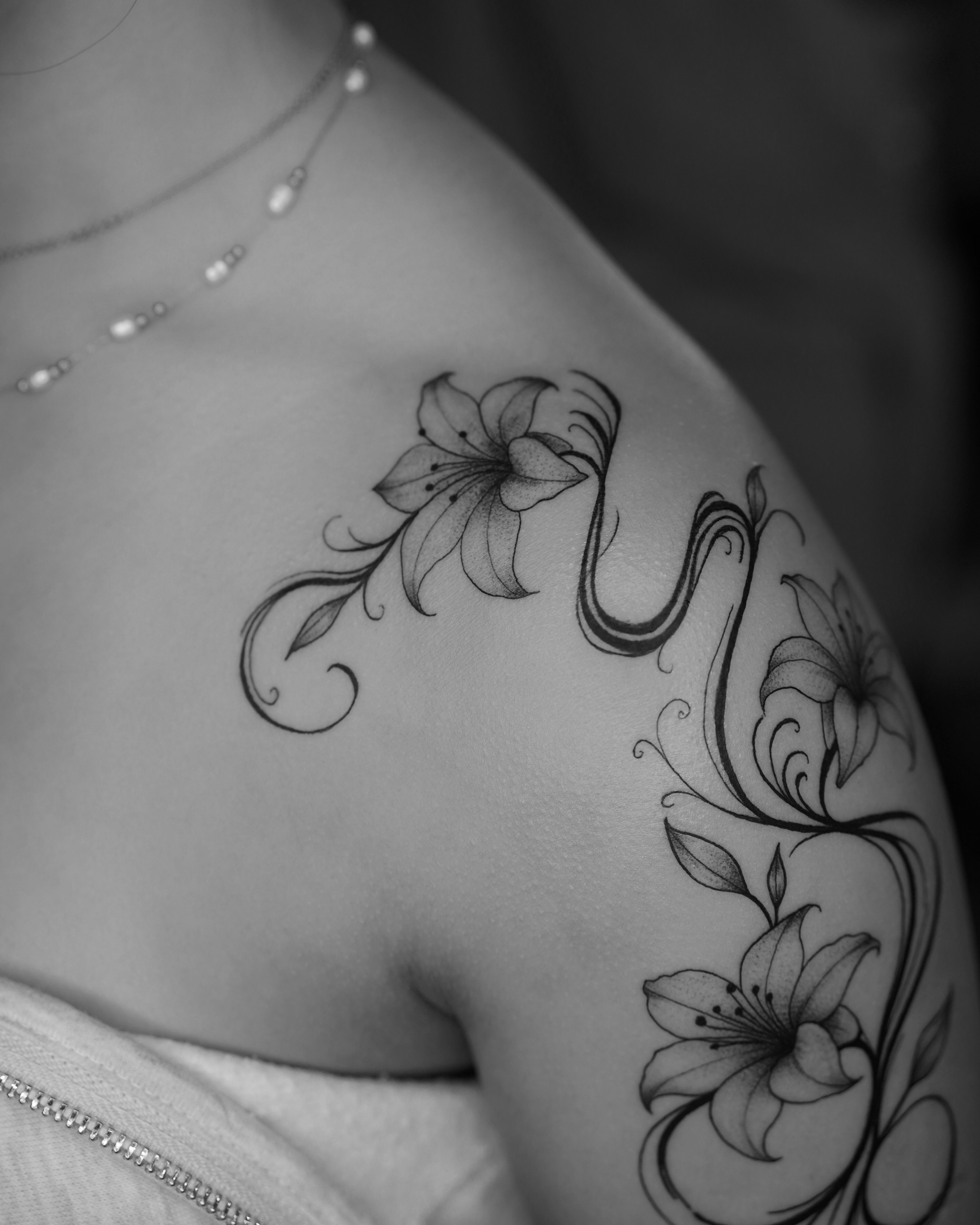
Quality botanical work often layers fineline tattooing with realism shading techniques. The outline carries the silhouette; the shading creates dimension. Neither element works alone at the level a skilled artist is aiming for.
What a Strong Floral Portfolio Actually Shows You
Line consistency across the whole piece
Start at the outermost petal and follow the line inward toward the centre of the flower. Does the weight stay consistent? Does the line taper naturally where the artist intended, or does it wobble? A piece that looks beautiful in a thumbnail can reveal inconsistency at full zoom. Take the time to look closely.
Consistent line weight throughout the full composition. From the statement bloom to the smallest background leaf. Is one of the clearest signals of a practiced hand. Variation in weight should feel deliberate, not accidental.
How the artist handles negative space
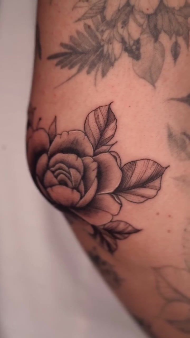
Negative space is the bare skin between design elements. In botanical work, it carries as much visual weight as the ink itself. Skin left between petals should feel like a conscious decision, not the gap that remained after the artist ran out of ideas. A crowded floral piece with no breathing room will blur as it heals and ages. An open one, designed with restraint, will stay legible for years.
Healed work versus fresh work
Fresh tattoos photograph beautifully. The ink sits high in the skin, the contrast is sharp, and the piece looks its absolute best in those first few hours. What you need to see is how it looks six months later. Ask any artist you're considering for healed photos of their botanical work. If they don't have any, that's a real gap in their portfolio. Not an oversight.
You can find examples of the floral tattoo work at the studio across both fresh and longer-term client results. The difference between the two states tells you more about an artist's technical foundation than any fresh piece ever could.
The Styles That Sit Under the Floral Umbrella
Fineline botanical
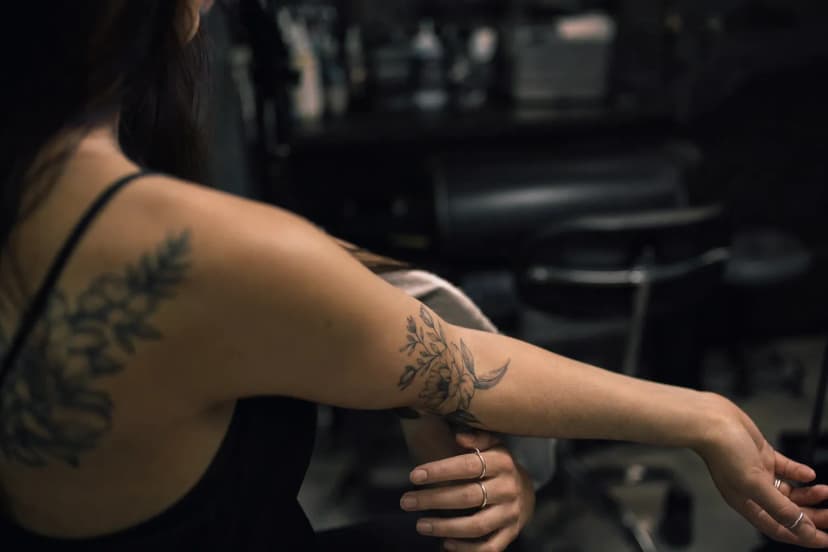
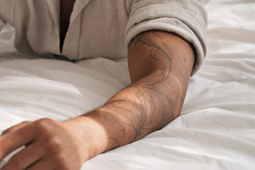
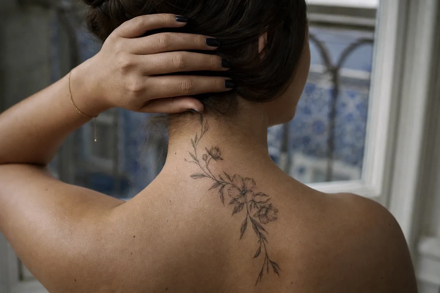
Single-needle botanical work produces gossamer lines that feel almost drawn rather than tattooed. It suits smaller placements. A collarbone, a wrist, the back of an ankle. Where the design needs to stay refined without overwhelming the area. The ink is often diluted to create soft grey tones, mimicking pencil shading rather than solid fill.
Micro realism flowers
Micro realism brings photographic depth to a small footprint. Petals look three-dimensional. Shadows are built up in layers using stippling (tiny individual dots of ink) and soft blending. A peony rendered in micro realism can sit within a 6cm circle and still read like a close-up photograph. This approach is more technically demanding and requires an artist who has specific experience in micro realism work. The tolerances are far tighter than standard botanical linework.
Minimalist floral
Minimalist botanical strips the flower back to its essential silhouette. No shading, little tonal variation, strong use of negative space. The design works through what it leaves out. Done well, a single clean stem with two leaves carries real visual weight. Done carelessly, it just looks unfinished.
Each approach demands different needle configurations and ink dilution ratios. A skilled artist will explain which sub-style fits your idea during the consultation. Not after the stencil goes on.
| Sub-style | Typical session length | Ideal placement | Longevity considerations |
|---|---|---|---|
| Fineline botanical | 90 min. 2 hours | Collarbone, wrist, upper arm | Very fine lines may soften over time; sizing is critical |
| Micro realism flowers | 2. 4 hours | Forearm, shoulder blade, thigh | Holds well with proper sizing; avoid high-friction zones |
| Minimalist floral | 60. 90 min | Ankle, ribcage, inner wrist | Simple lines age cleanly; negative space prevents blurring |
| Botanical sleeve section | 4. 6 hours per session | Full arm, thigh | Multiple sessions; layering builds long-term depth |
How the Studio Approaches Floral Design in Lisbon
The consultation: where design actually begins
Nothing here gets pulled off a wall. Every botanical piece the studio produces starts from a conversation and a custom sketch built around your idea, your body, and your placement. Reference images help communicate mood, not mandate. Bring them to show what draws you to a particular flower or composition style. But expect the design to evolve from there.
"A strong reference photo tells me what you feel, not what I should trace. The real design starts when I understand both your idea and the placement it's going on."
If you're still building your understanding of what to look for before booking, the guide on what to look for in a floral tattoo artist in Lisbon walks through the questions worth asking at that stage.
Placement and how Lisbon's climate factors in
Lisbon summers are intense. July and August regularly push above 35°C, and the humidity along the river near Cais do Sodré and Alfama means fresh tattoos face real heat stress during peak healing weeks. Aftercare in those months looks different to January: you'll go through more unscented moisturiser, you'll need to stay out of direct sun more strictly, and sweat management becomes a genuine consideration.
The studio discusses this during every consultation booked for summer sessions. It's not a reason to wait. It's a reason to plan placement and aftercare carefully from the start.
Areas that flex significantly, like the inner elbow or behind the knee, get an honest conversation before any deposit changes hands. Fine floral lines in those zones will soften faster than the same design on a shoulder blade. That's not a dealbreaker, but it's information you deserve before you decide.
Practical Guidance: Sizing, Placement, and What to Bring to Your Consultation
Size and what it means for detail
Anything under 5cm with dense floral detail will lose definition as the skin matures. Lines pack together and the piece loses the crispness it had on day one. The studio will advise on a minimum viable size for your specific design. And that conversation can save you from a piece that looks great for two years and muddy for twenty.
The relationship between scale and longevity is one of the most important things to understand before committing to a small botanical piece. If you're drawn to very fine detail, sizing up by even 1-2cm can make a significant difference to how the tattoo reads a decade from now.
Placement longevity by body zone
Forearm, upper arm, shoulder blade, and thigh are the most forgiving placements for botanical work. Skin in those areas moves relatively little, doesn't face constant friction, and holds fine lines well over time. Hands and fingers are honest territory: the ink fades faster there, touch-ups are more likely, and that's worth knowing before you fall in love with a knuckle rose. The studio won't push you away from those placements, but it will be straight with you about what to expect.
For a broader look at how placement decisions play out across different body zones, the placement guide for smaller tattoos covers the key trade-offs in detail.
What to bring and what to expect
Preparation makes a real difference to how the session goes. Here's what helps:
- Bring reference images in colour. Close-up photographs of real flowers communicate tone and texture far better than screenshots of other tattoos.
- Wear, or bring, clothing that gives clear, easy access to the placement area without needing to contort yourself halfway through a two-hour session.
- Eat a proper meal within two hours of your appointment. Blood sugar matters during longer sessions.
- Come with skin that's clean, moisturised (but not on the day itself), and free from sunburn. Especially relevant in Lisbon's summer months.
- Have a rough idea of the mood you want: delicate and spare, lush and layered, graphic and bold. You don't need exact answers, just a direction.
Beyond the practical checklist, it helps to spend some time looking at the style categories that interest you. If you're drawn to very fine detail, reading about fineline tattooing and its technical demands gives you useful language for the consultation conversation.
- Single-needle fineline suits those who want delicacy and subtlety over graphic weight.
- Micro realism is the right call if you want botanical depth and a near-photographic quality in a compact space.
- Minimalist floral works for clients who value restraint and want the design to feel intentional and spare.
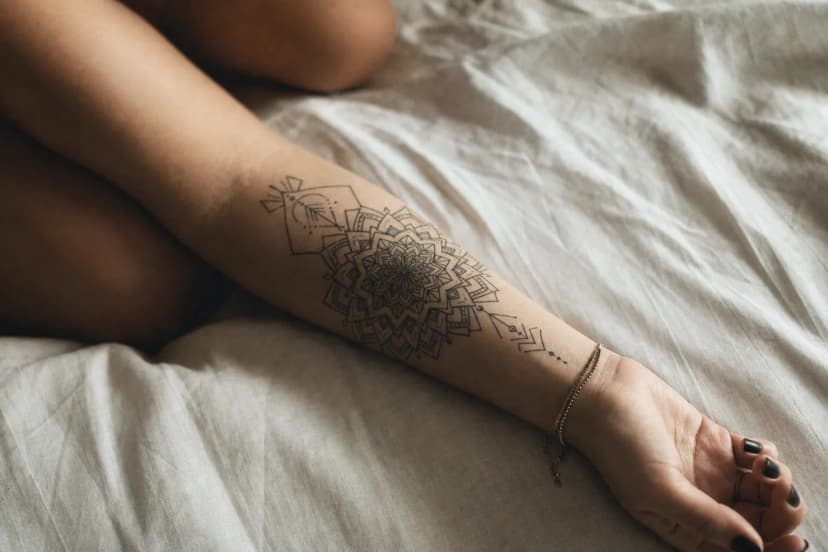
Combining floral elements with geometric framing or lettering is also well within range. The key is designing the combination as a unified piece from the beginning, not assembling it from parts. A geometric border around a botanical arrangement works when both elements share the same visual grammar. Spacing, weight, tonal range. Approached that way, the result is coherent rather than crowded.
Frequently Asked Questions
How do I know if a floral tattoo artist is actually skilled?
Look for consistency in line weight across the full piece, not just in the focal flower. Ask to see healed photos, not only fresh work. A skilled botanical tattooer can also explain why they chose a particular needle gauge or shading technique for your specific design and placement. That knowledge shows in the conversation, not just the portfolio.
How long does a floral tattoo session usually take?
A small single-flower fineline piece typically takes 90 minutes to two hours. A larger botanical sleeve section can run four to six hours across multiple sessions. The complexity of shading, the number of petals, and the placement all affect timing. Your artist will give a clearer estimate after seeing your reference and discussing the design in detail.
Which placement is best for a floral tattoo that stays crisp?
Upper arm, shoulder blade, forearm, and thigh hold botanical detail well over time. Areas with heavy friction. Inner wrists, fingers, feet. Fade faster and may need touch-ups sooner. Anywhere that flexes repeatedly, like the inner elbow, can cause fine lines to soften more quickly than the same piece would on a flatter, stiller surface.
Do floral tattoos age well?
They can, when the initial linework is clean and correctly sized. Very thin lines packed too tightly into a small area tend to blur as the skin matures. An experienced artist sizes the design to suit the placement and leaves enough negative space so the piece reads clearly five or ten years on. Not just in the week after it healed.
Can I combine floral elements with geometric or lettering styles?
Yes, and the combination can be striking when the styles are balanced intentionally. Geometric frames around botanicals, or script woven through a floral arrangement, work well when the artist designs them as a unified piece from the start. Not as separate elements placed side by side. The visual grammar needs to feel shared, not borrowed.